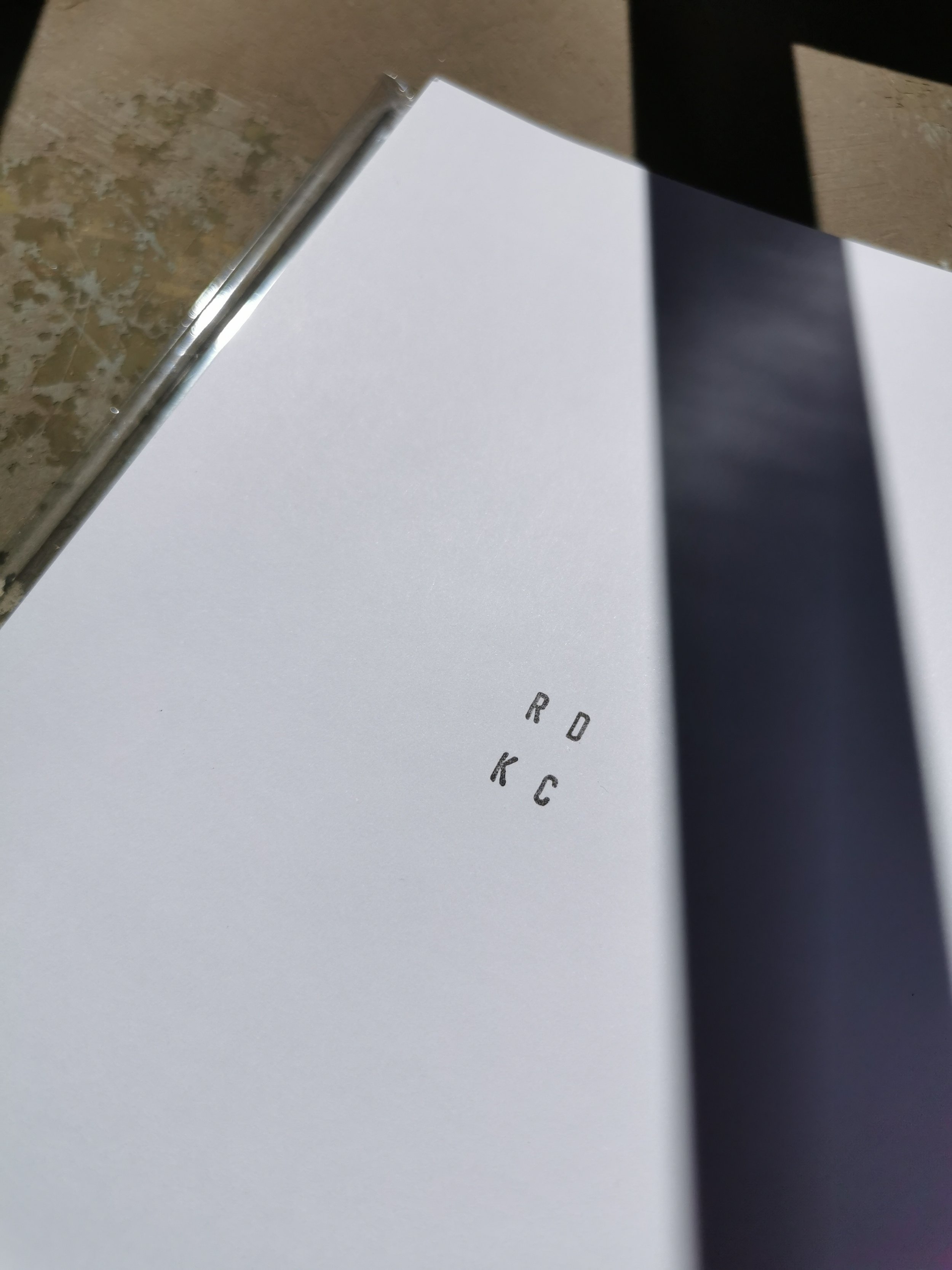
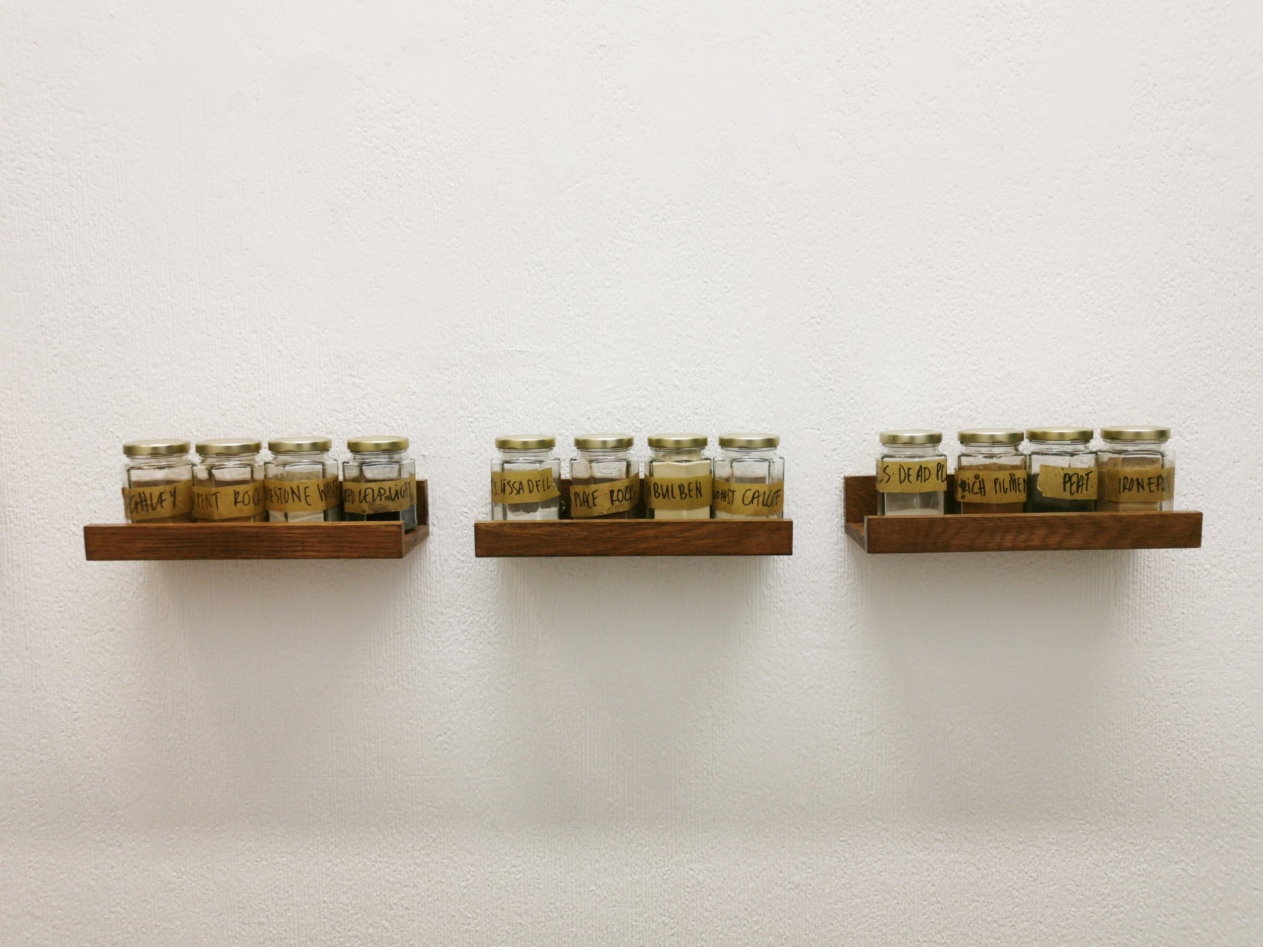
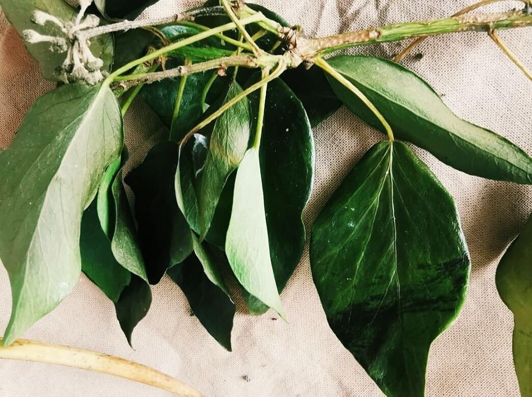
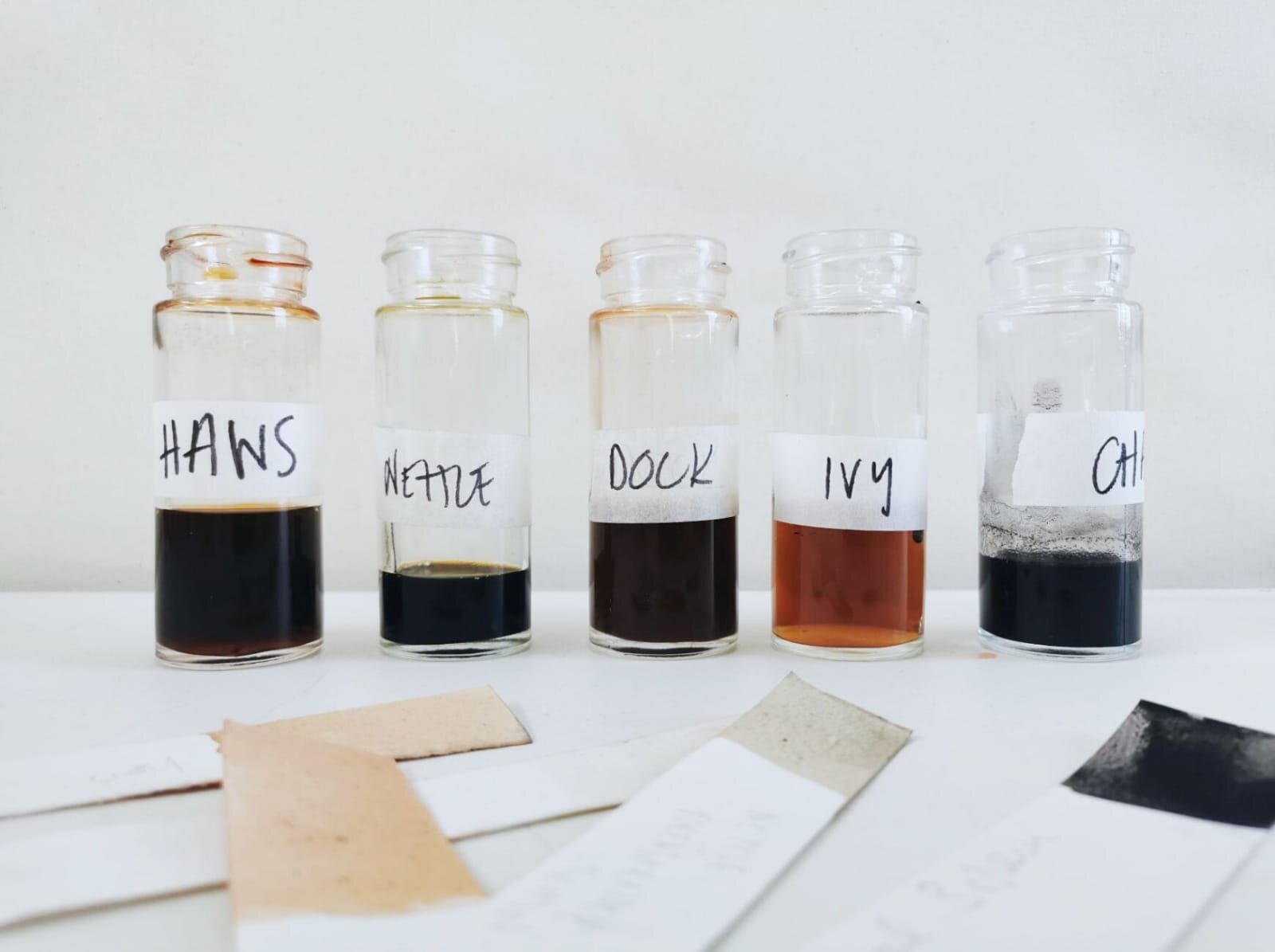
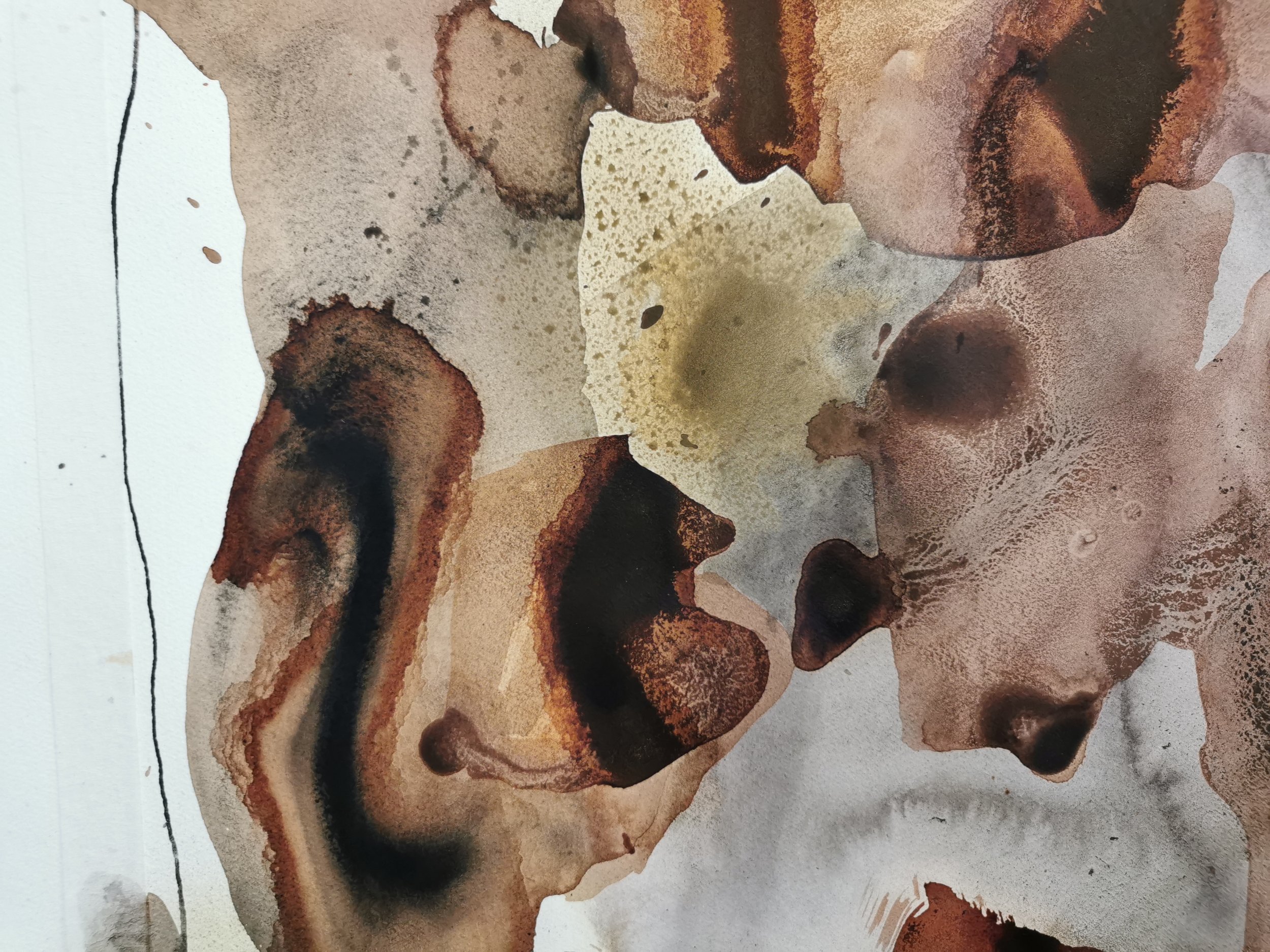
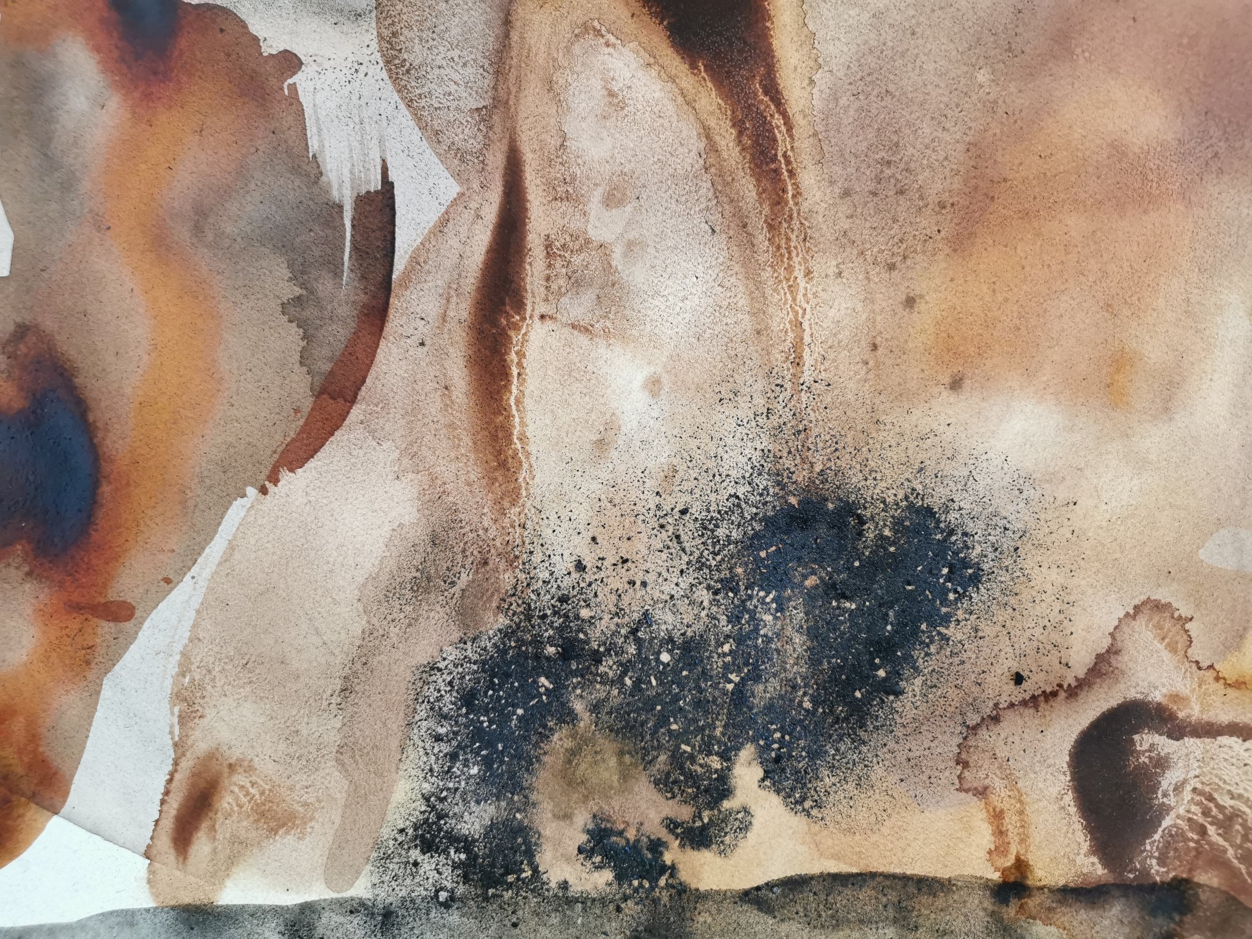
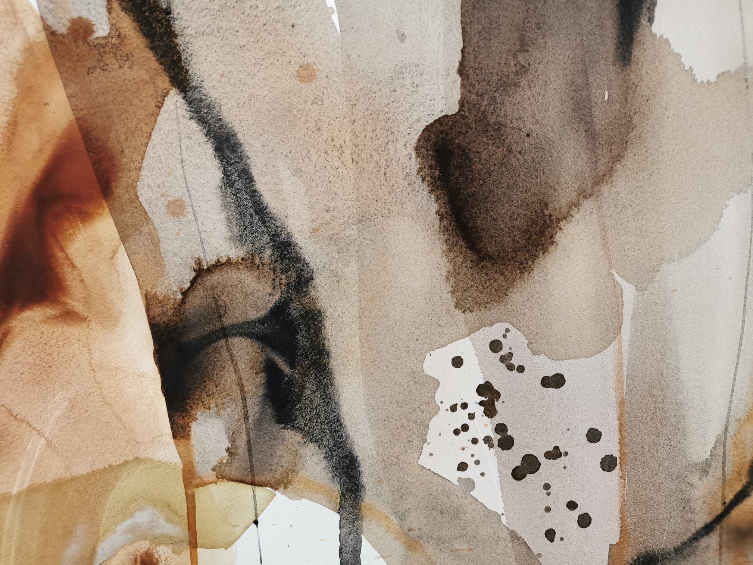
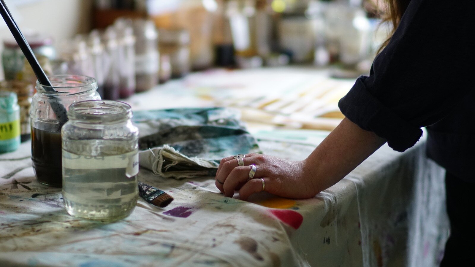
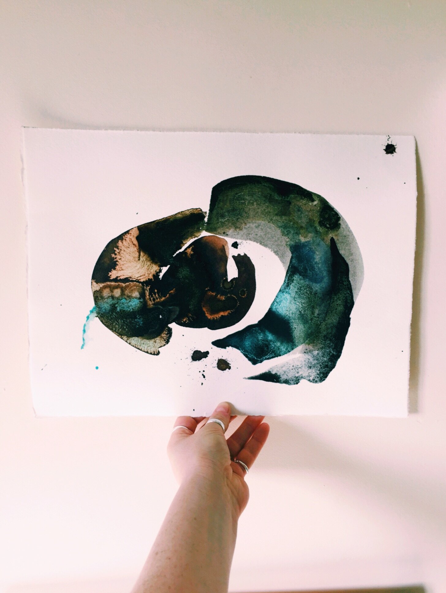
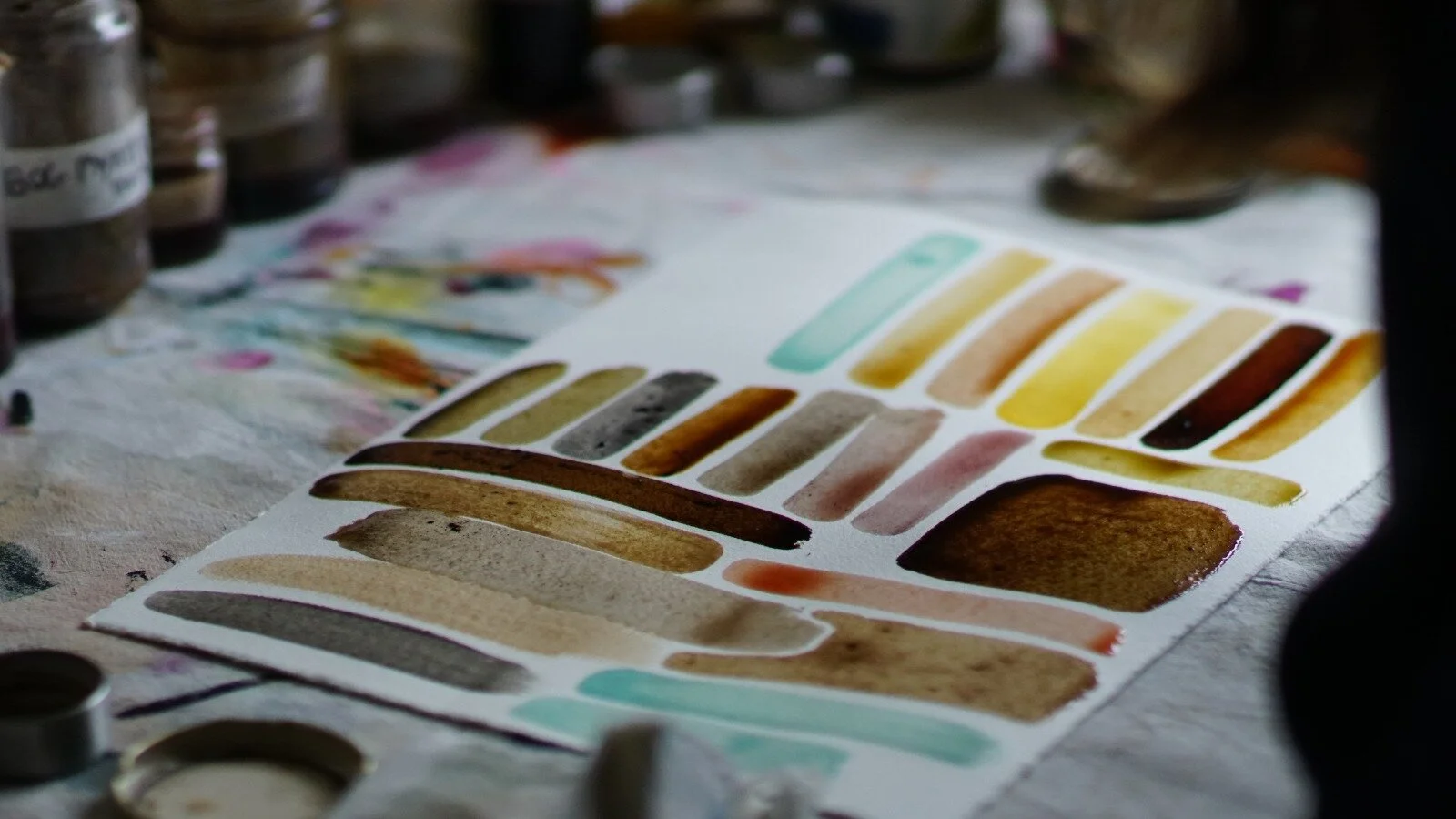
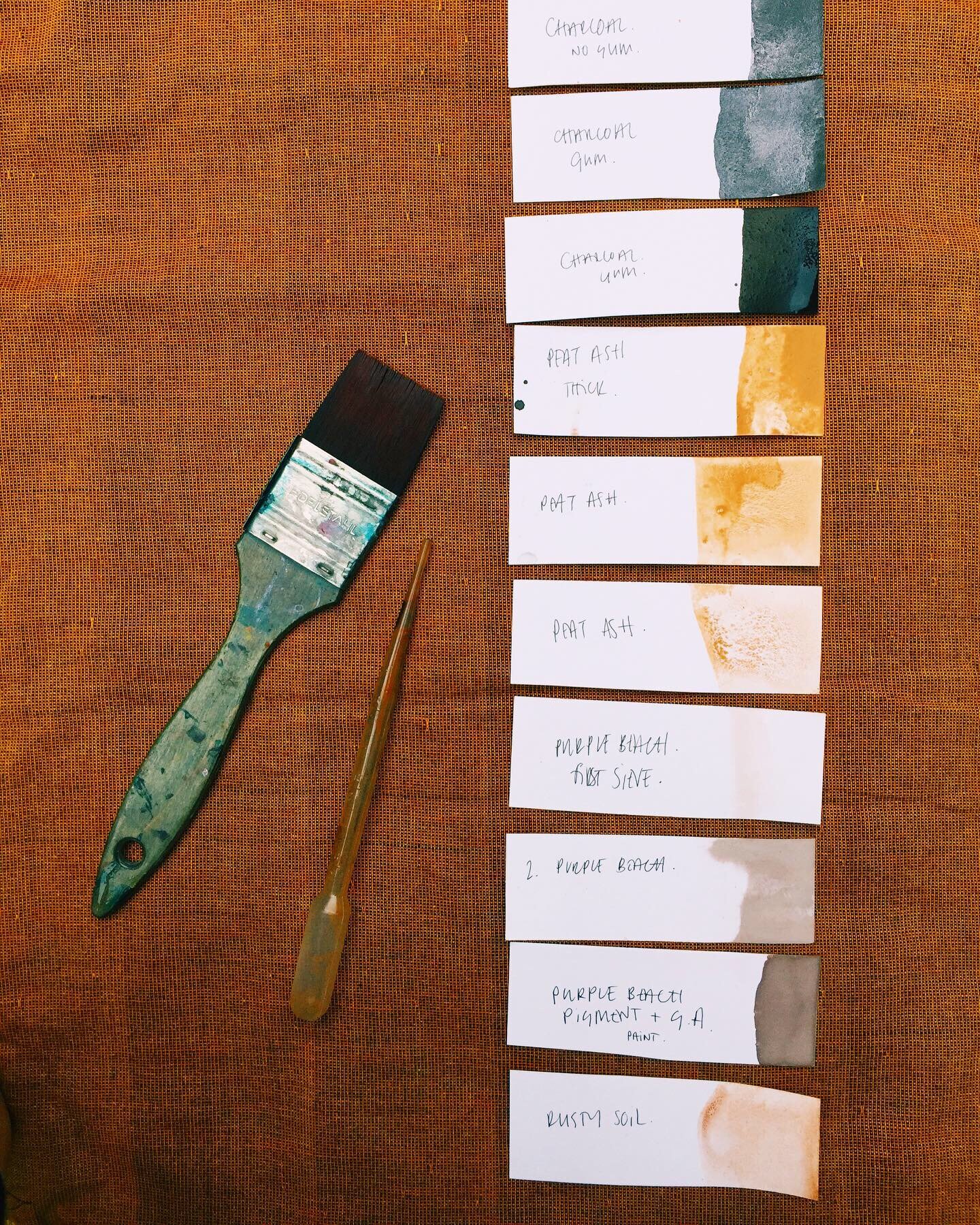
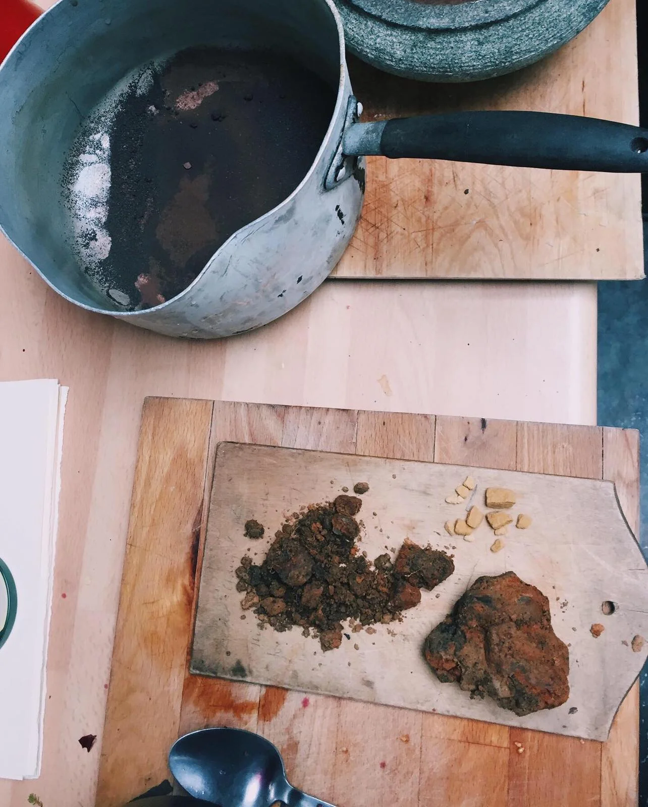
Our first conversations about art revolved around earth pigment. I asked Robert to sent ochre from Australia to Ireland in exchange for a painting. He collected the ochre and discussions continued about methods of processing the colour, separation, sieving and levigation.
Throughout the exchange conversations about art were always close at hand. Opinions on painting practice, writing styles, books, music, film, photography and ceramics were swapped regularly. Topics of light, colour, negative space, craft and process were touched on again and again and it became evident that our tastes aligned in so many ways when it came to our creativity.
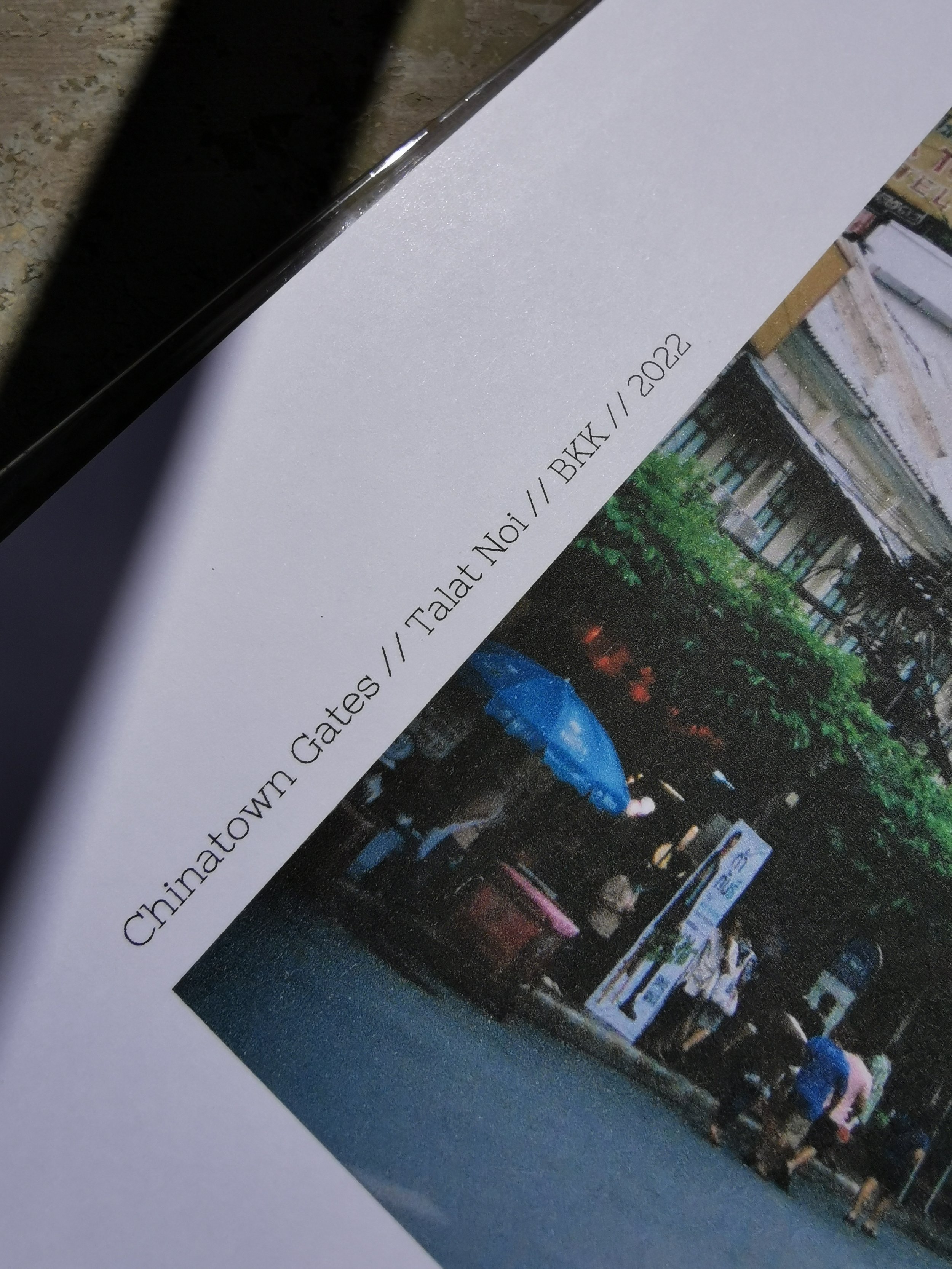
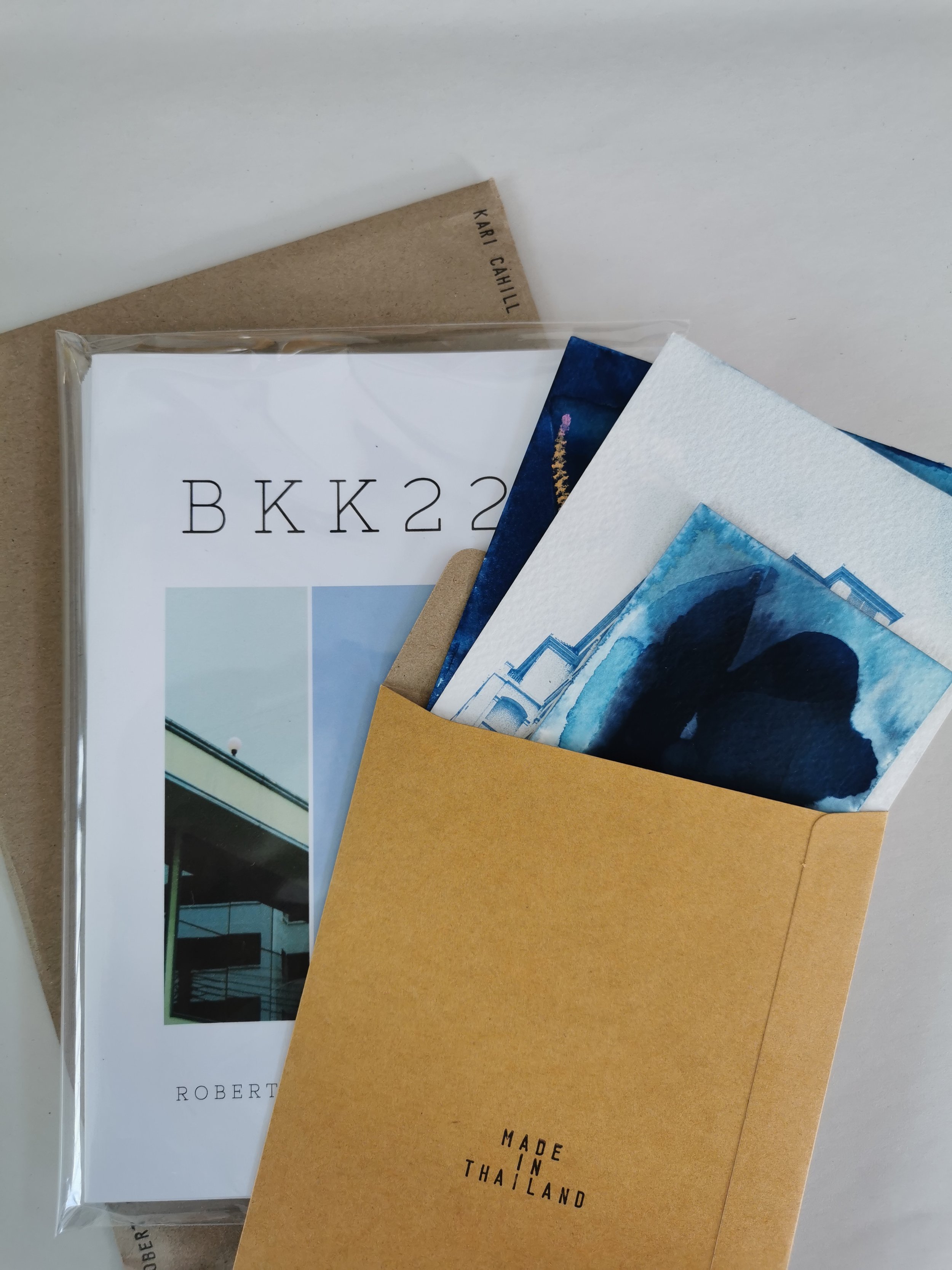
When the world opened up again after covid we wanted to explore the deep connection we had formed and investigate our practices in an in person collaboration. We chose Thailand as the meeting place and BKK222 was the product of our time together.
BKK- Bangkok
The city was in a lull post lockdown. Like most places on earth it was recovering from its own brand of trauma after the great upheaval to business-as-usual. There were very few tourists and domestic life seemed to be sprawling once again. The April air was humid and locals tucked into the shade beneath parasols and tarps. Peeling sunshine burned through the polluted fumes that rose from the traffic. Everyone wore masks inside and out. It was a busy hub of noise and haste but we weaved through it easily.
A cascade of open storefronts fell full across the paving. Businesses devoted to fruit or worship alongside displays of jewellery, gemstone, and convenience. Around the corner, the welding shop and the shop that sells locks. Lunchtime was a flowing bustle of brown limbs in the noonday heat. Along footpaths and side streets smoking coals sat in streetside stalls. The smell of cooking meat and sewage united in the air.

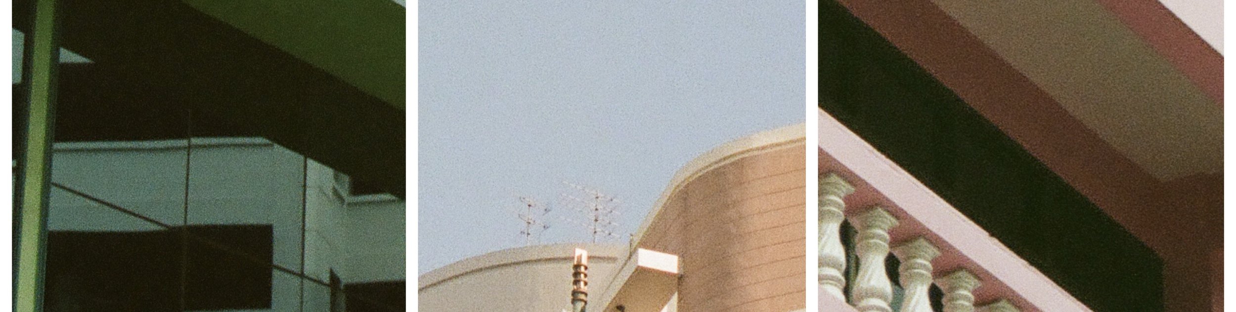
We two creative kin came to Thailand to explore the spark that lit between us when we spoke at length of art. Through the Bangkok concrete maze we combed the crowds in hope to catch a burst of light. A hunt amongst the sounds and shapes of glass and steel. A refracted flash absorbed into the darkness two blocks down. Take a right turn. Take a left. Take a break. Take photographs.
For now we play it safe and take it slow. Stick a straw into a coconut, eat mango sticky rice at the boat ramp with the catfish and the pigeons. Sit here a while and listen in to evening chat and river water.
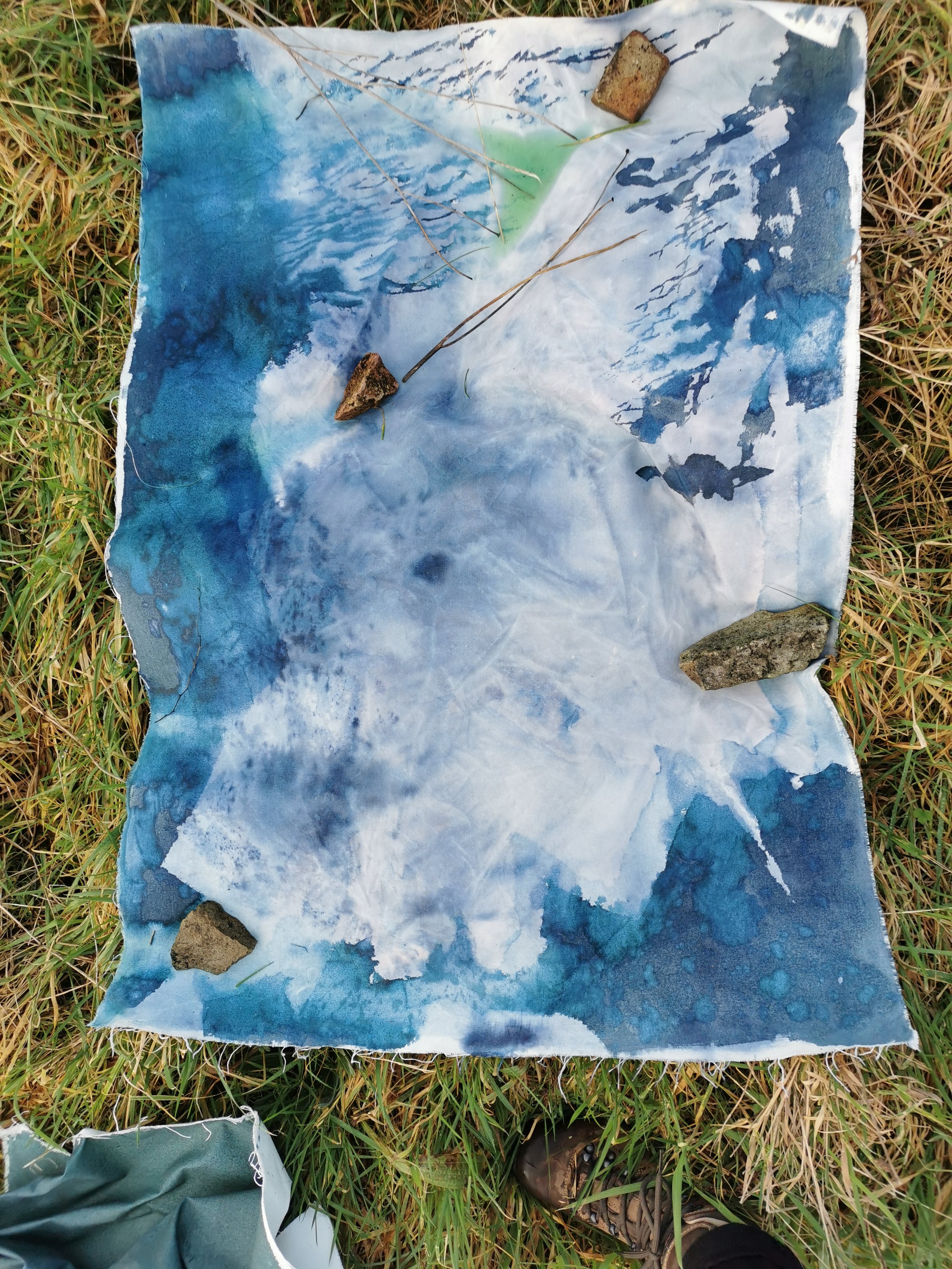
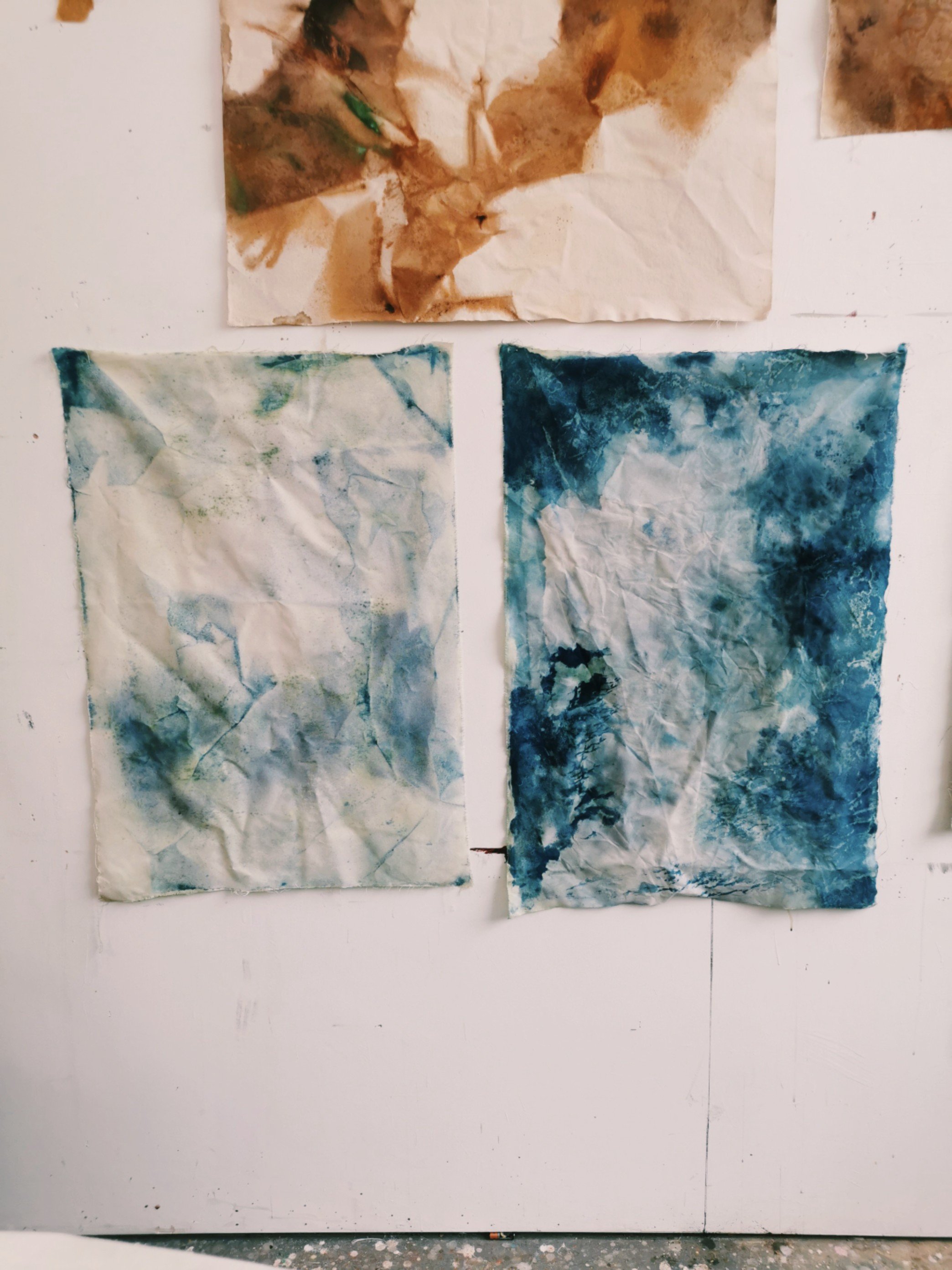
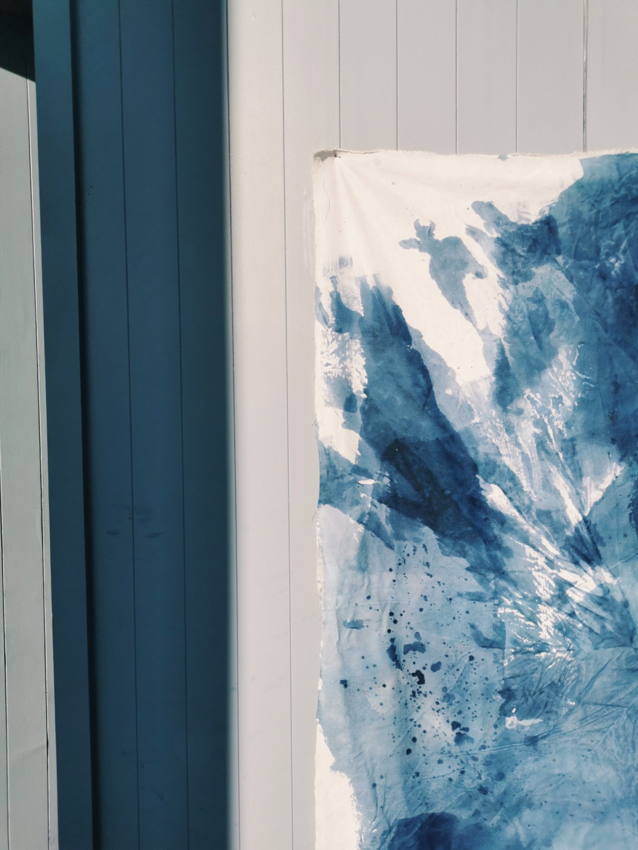
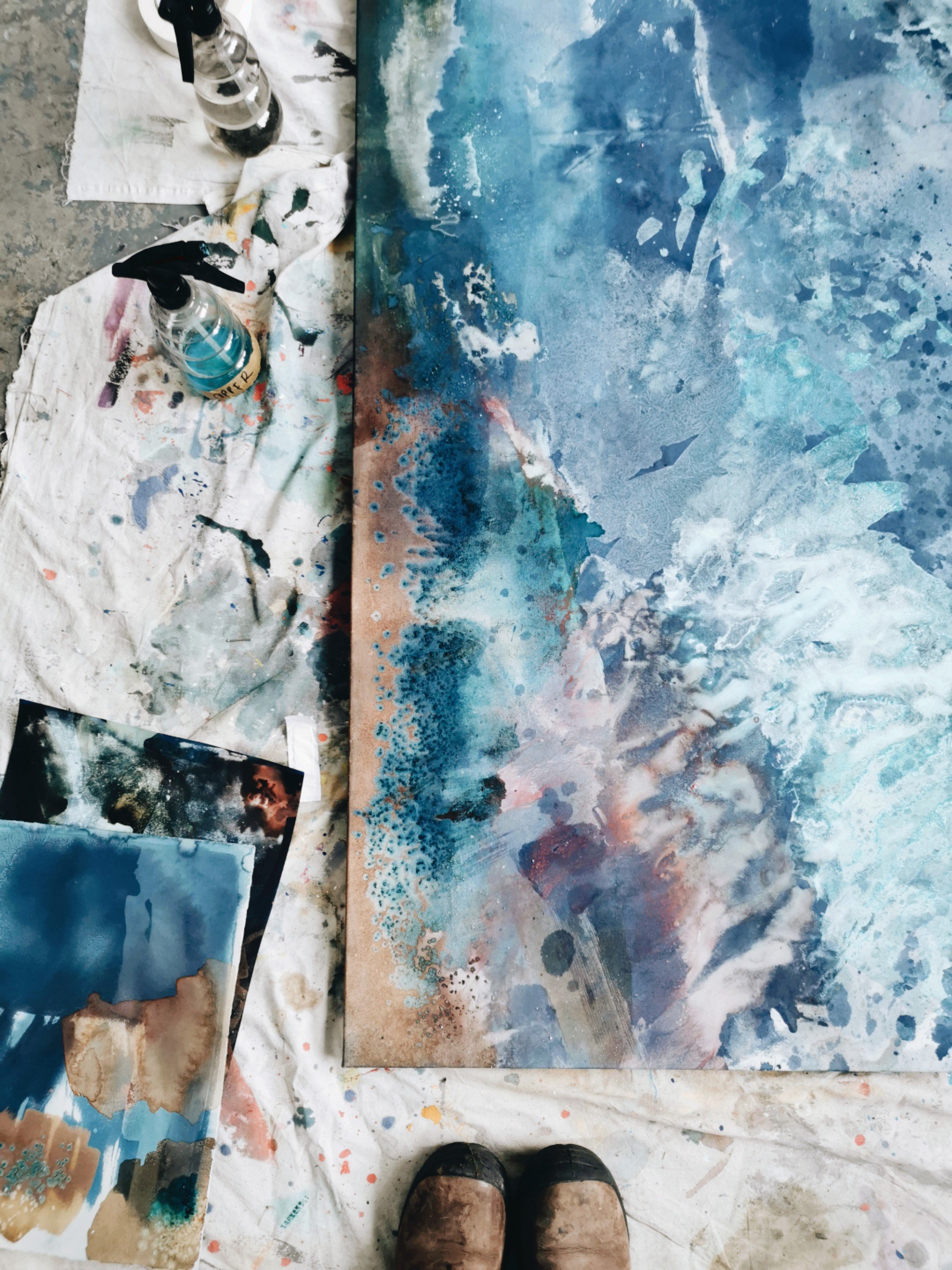
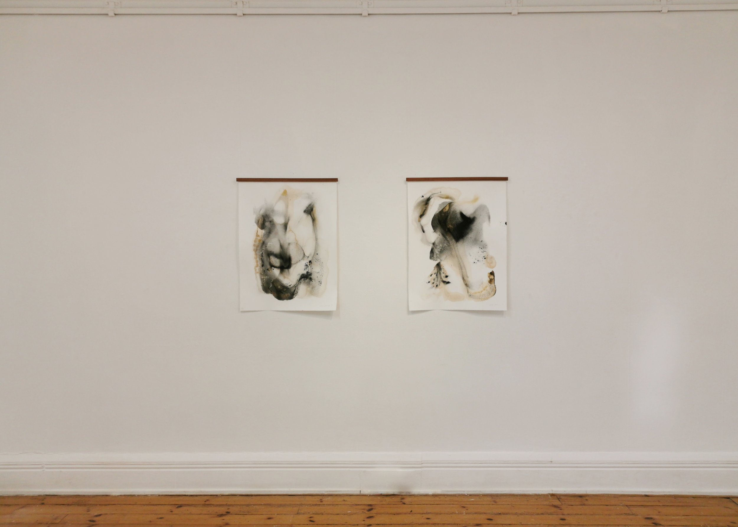
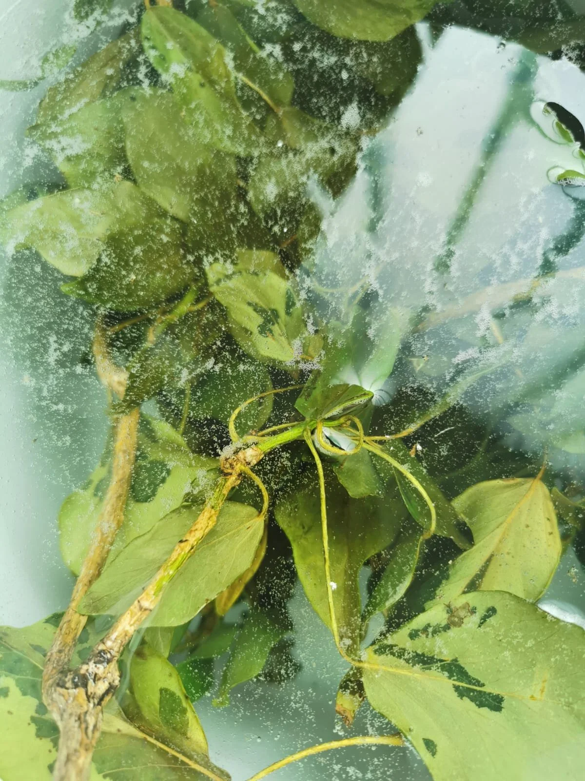
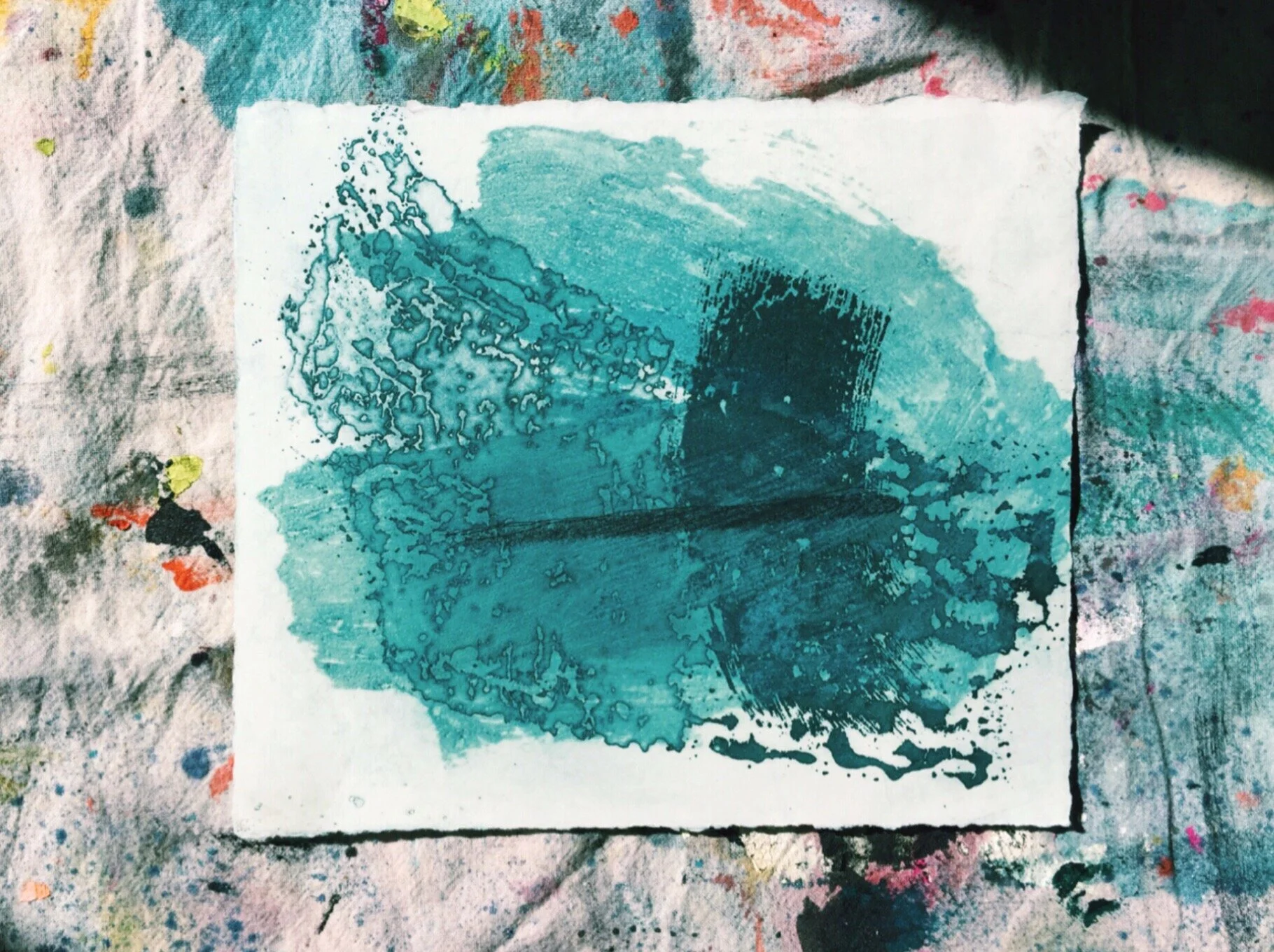
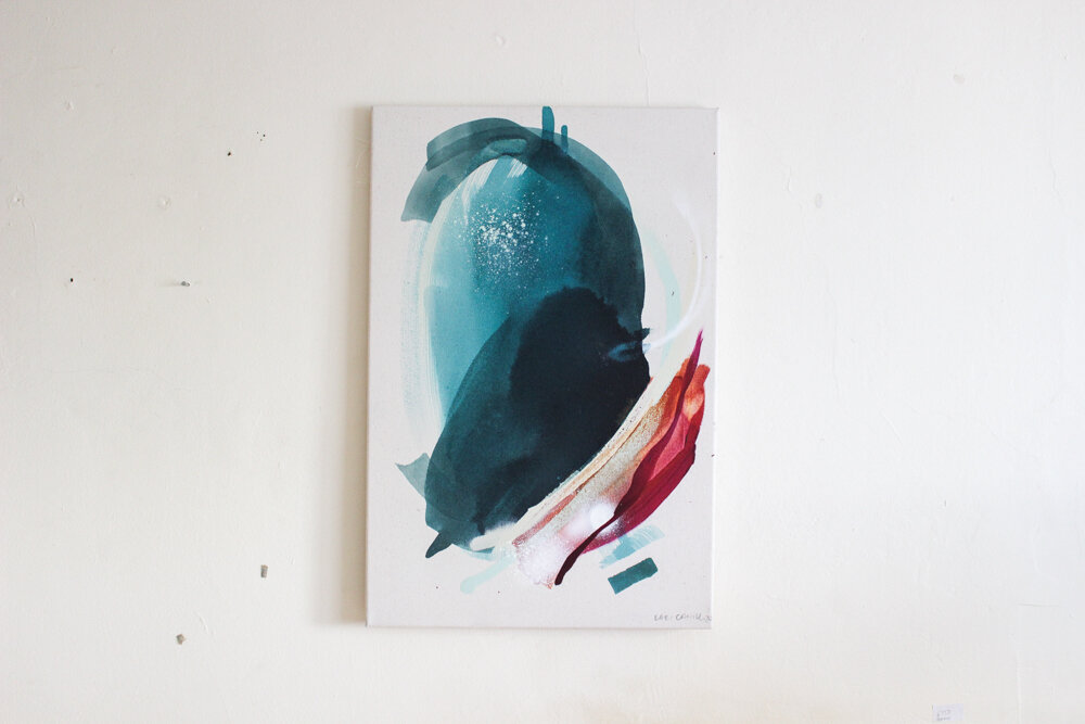
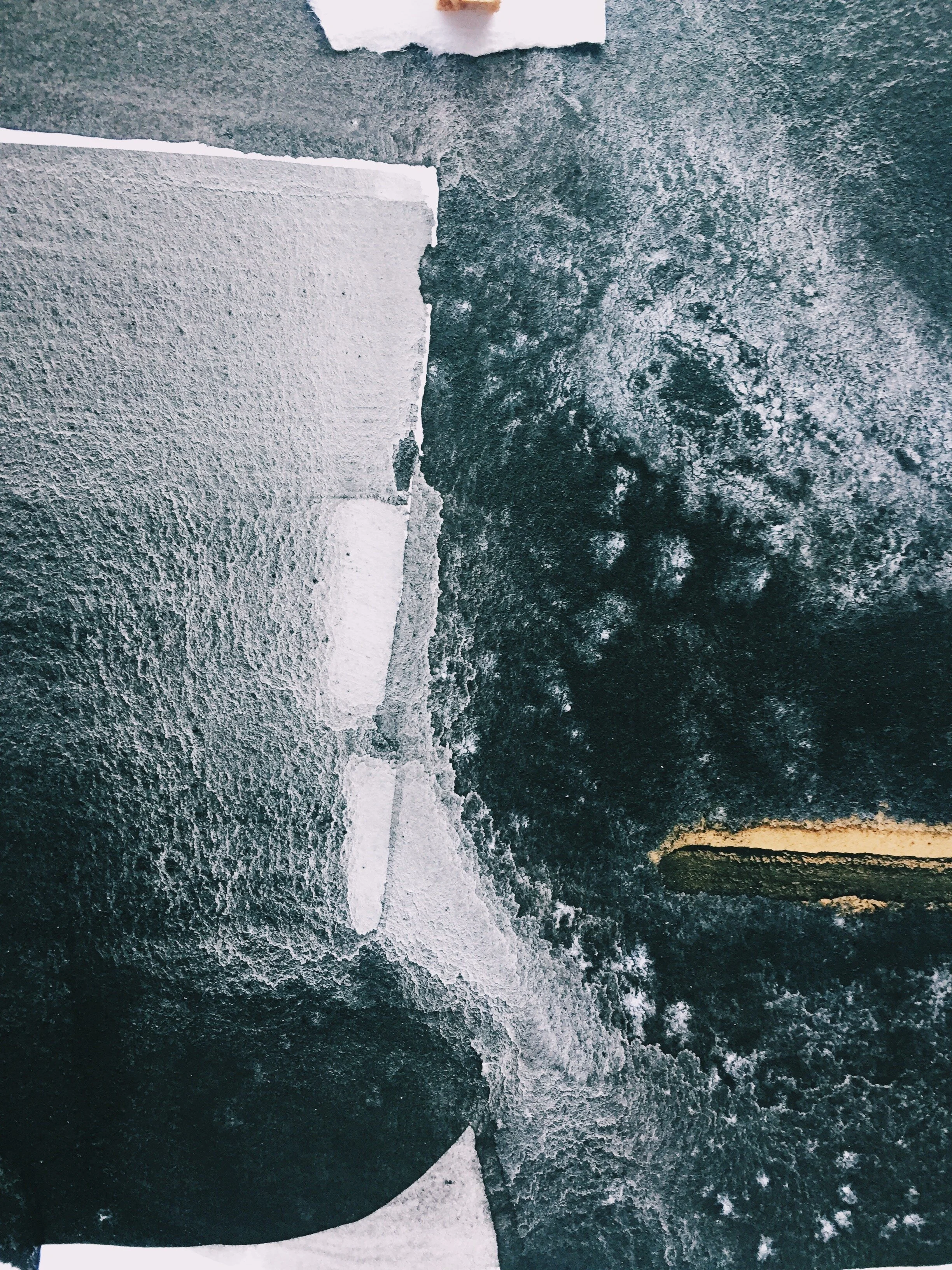
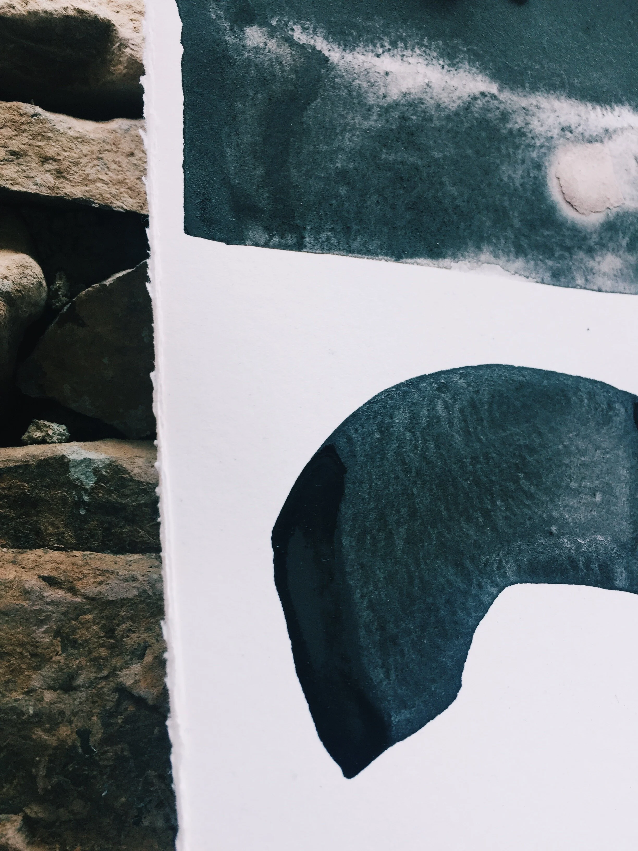
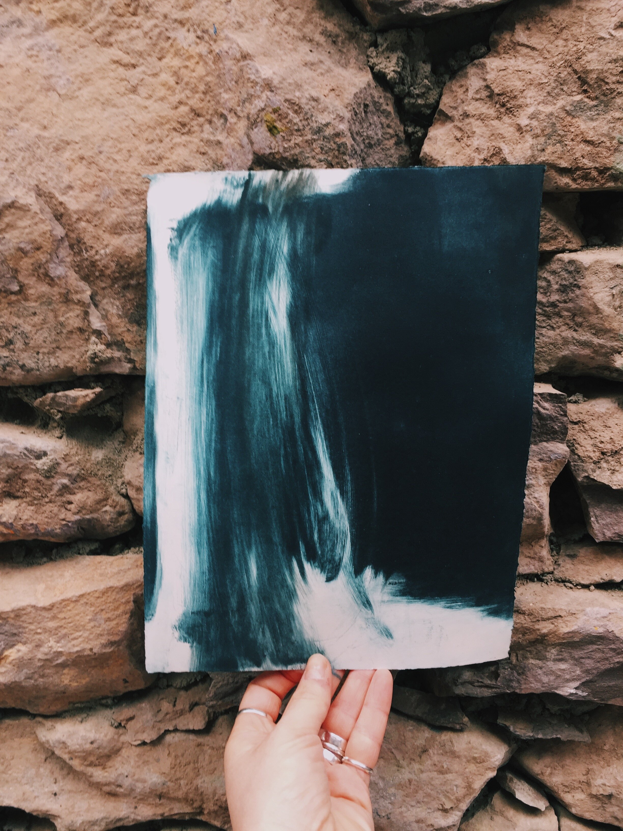
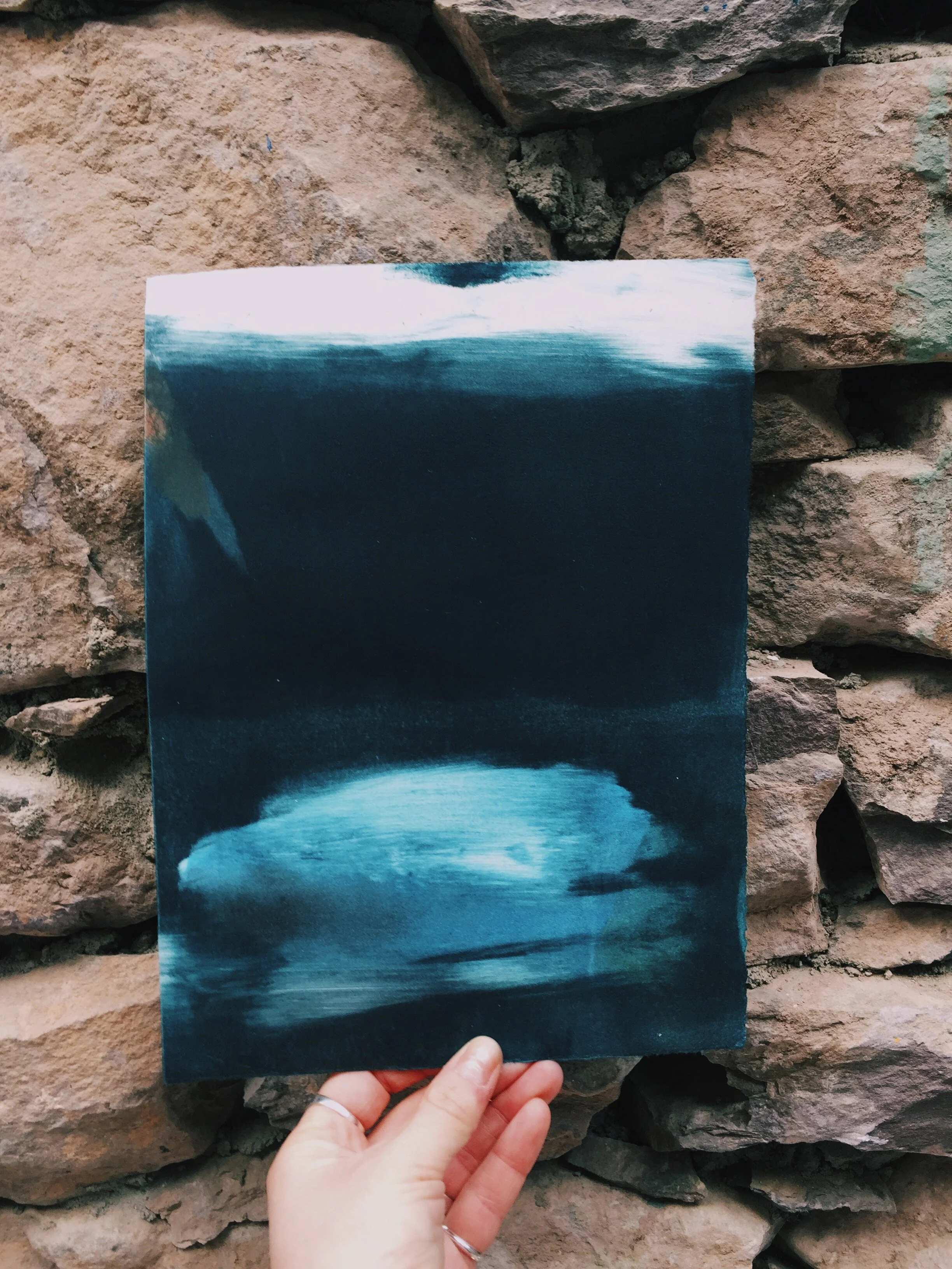
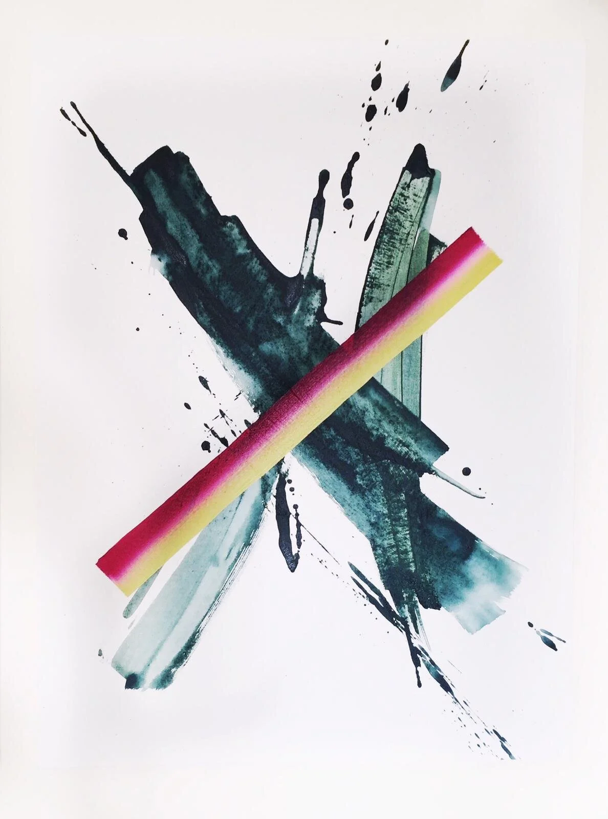
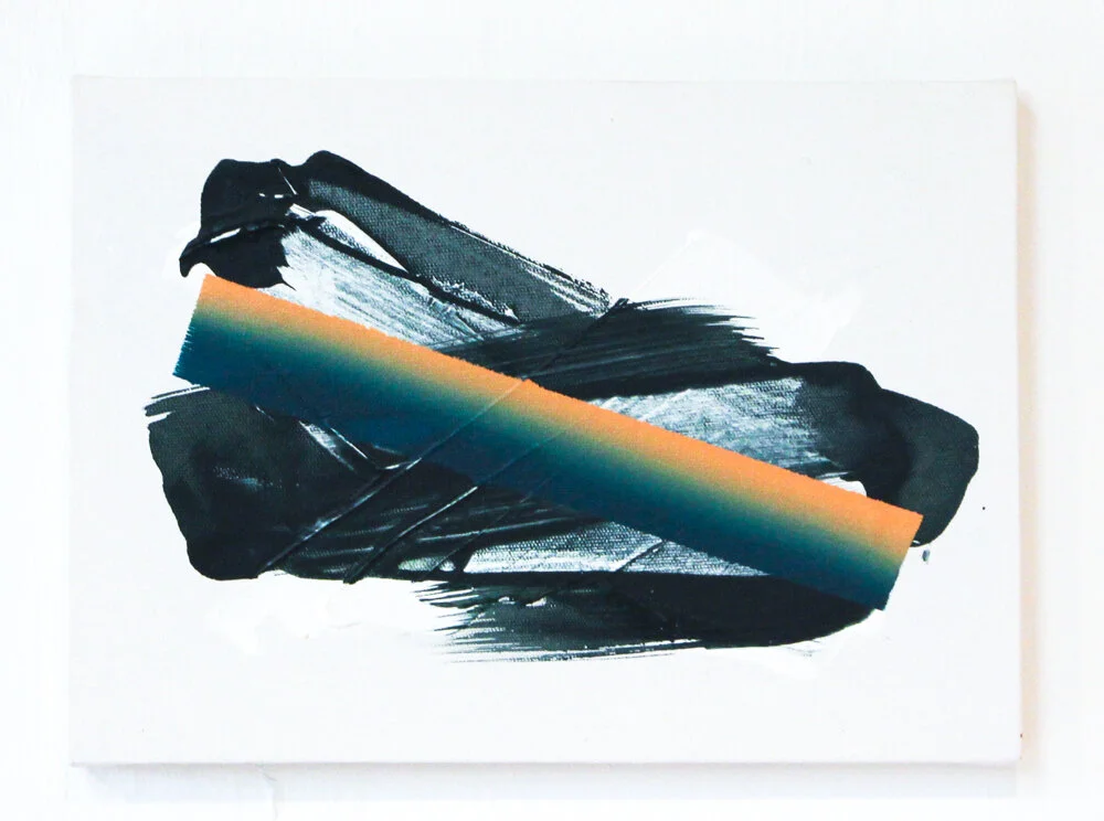
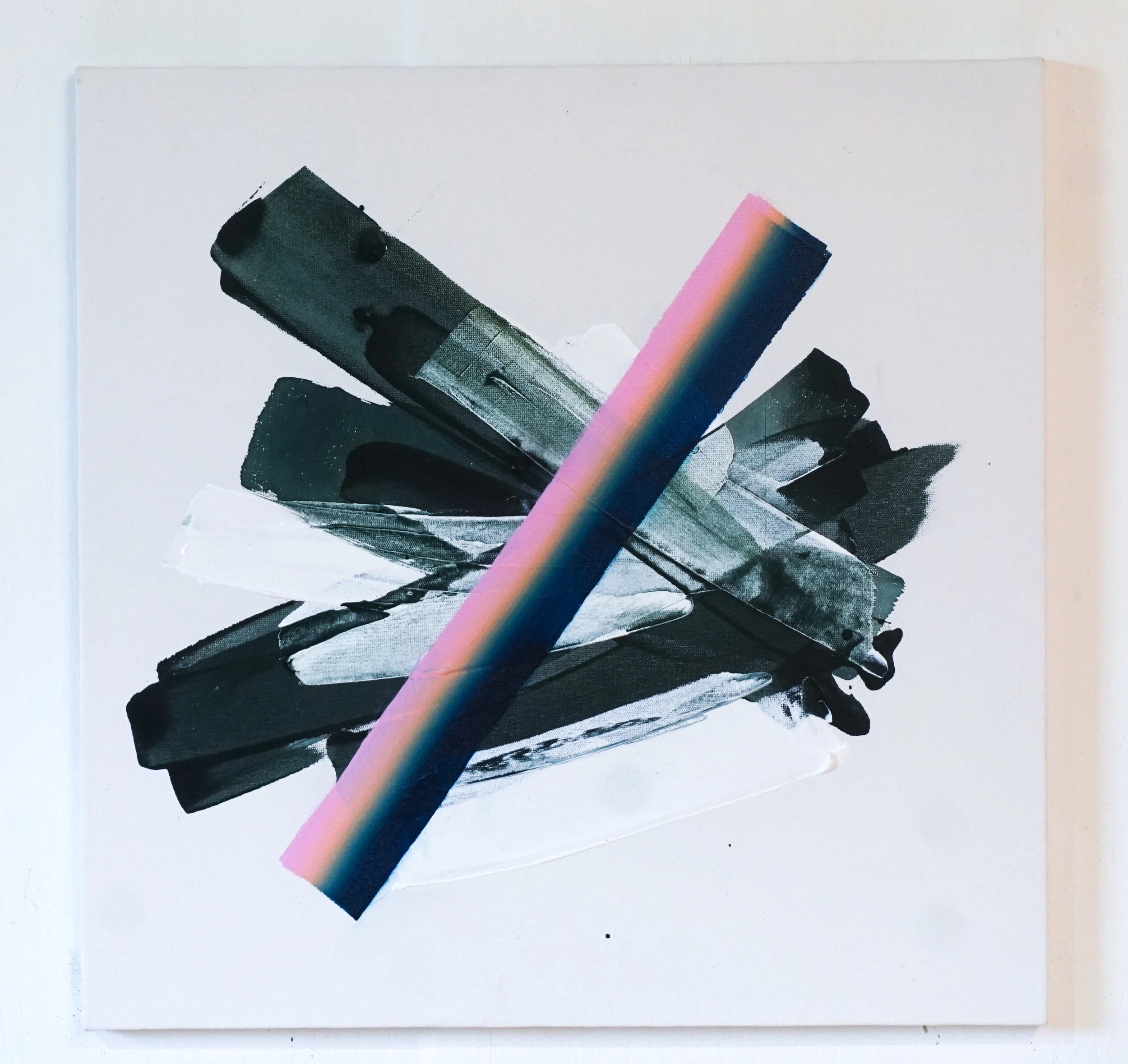
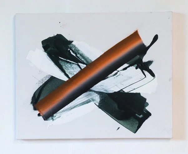
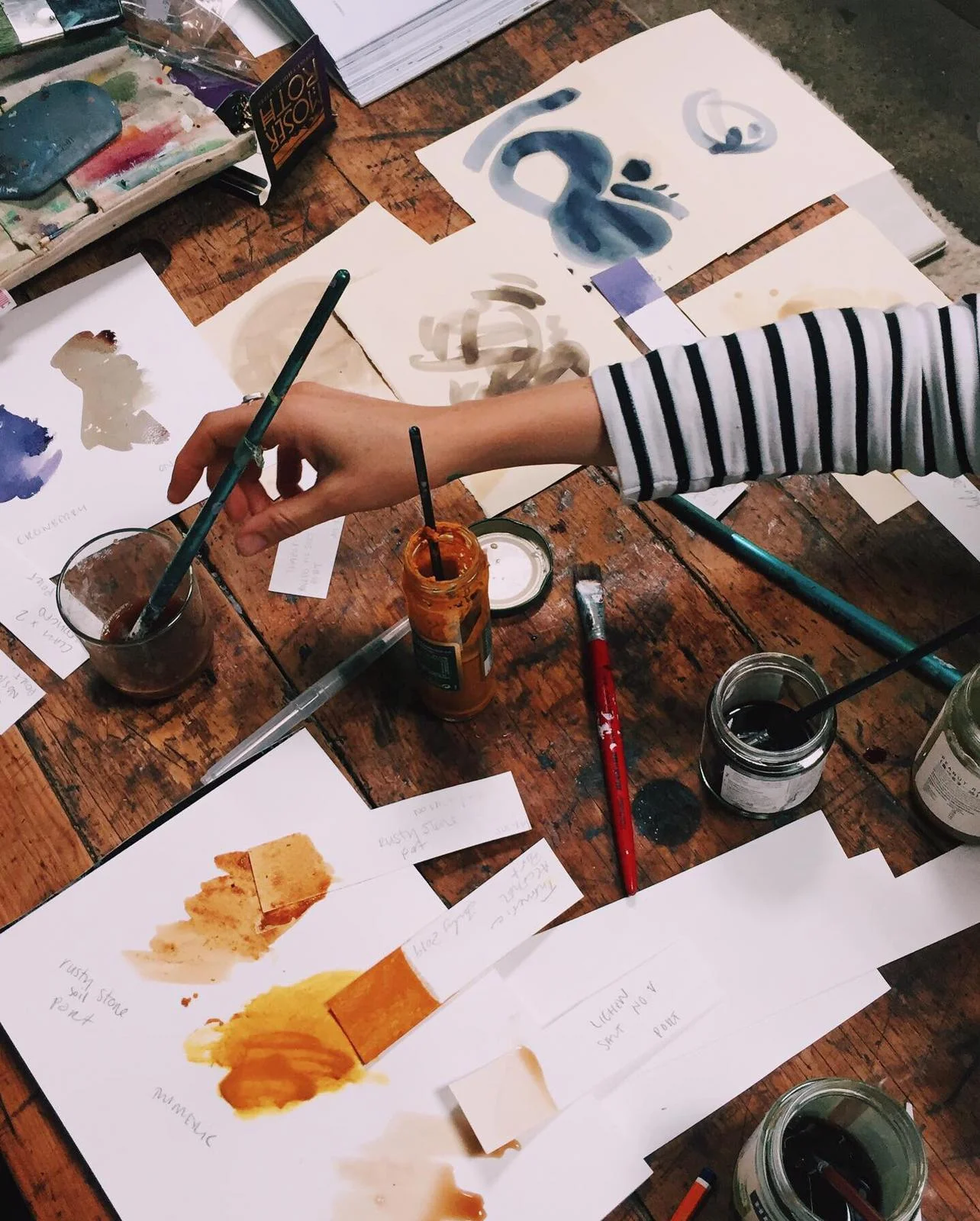
At nightfall, in our quiet room above the streets, we tried to make sense of the search so far. Sketches, notes, screenshots, scans. Artists’ bags flung open, sprawled across the space. We prepared canvas and paper in the dark with diluted metal salts. Cyanotype was the link between our practices. A charged yellow dye ready for tomorrow’s ultraviolet light.
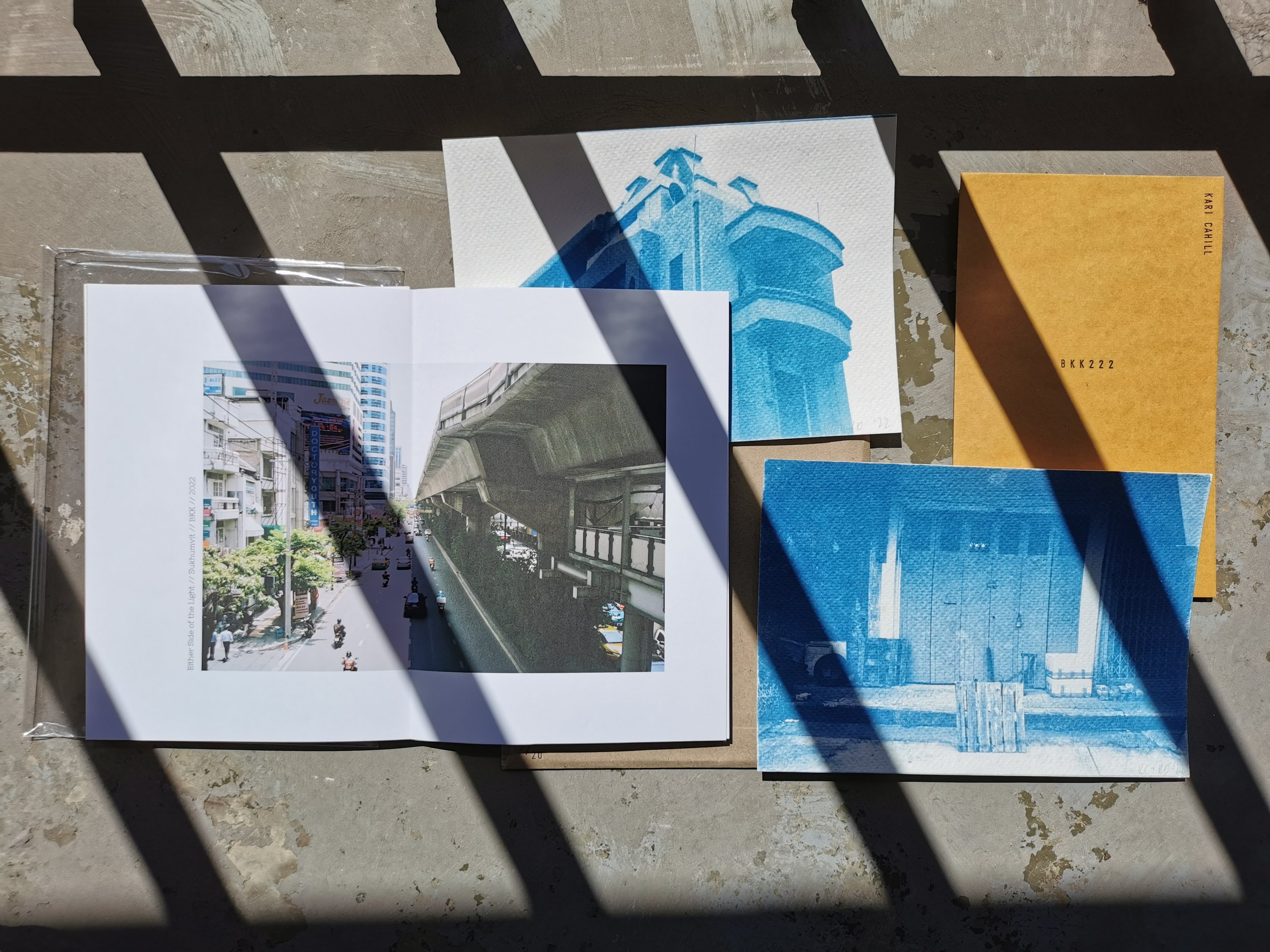
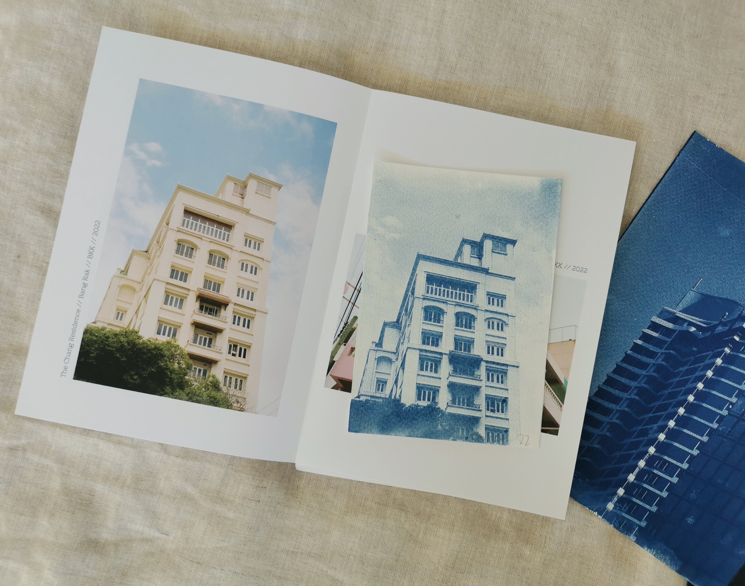
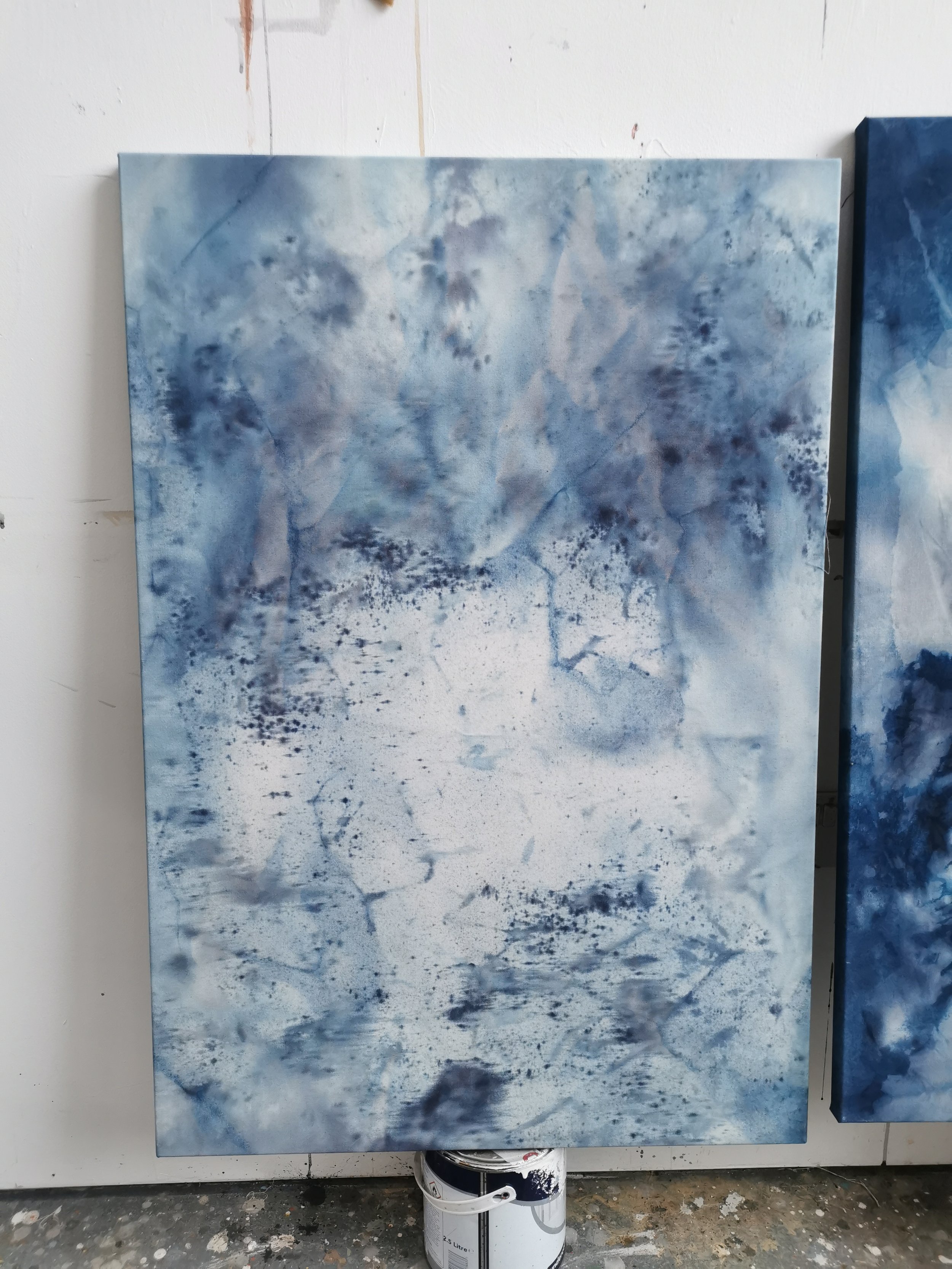
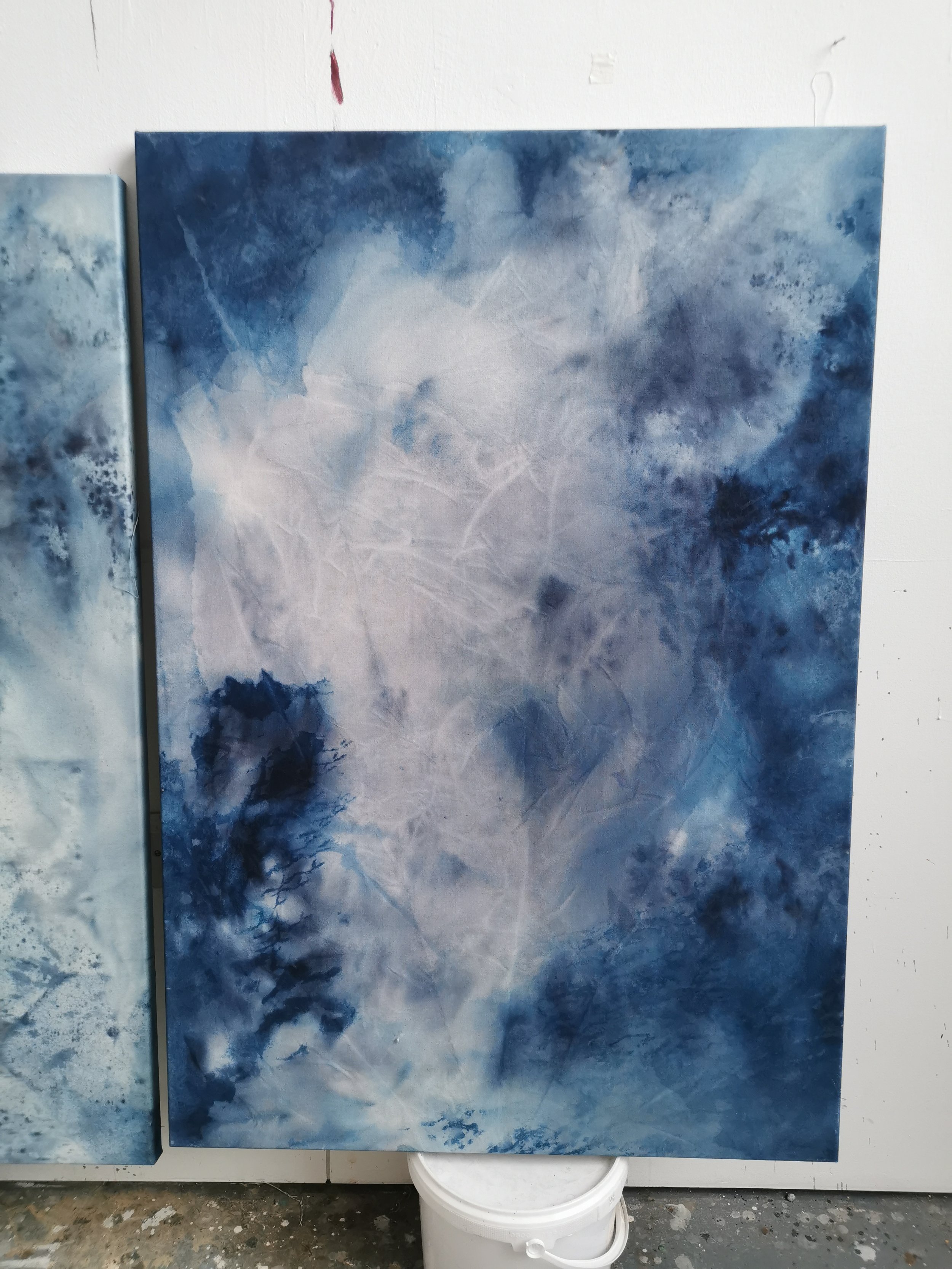
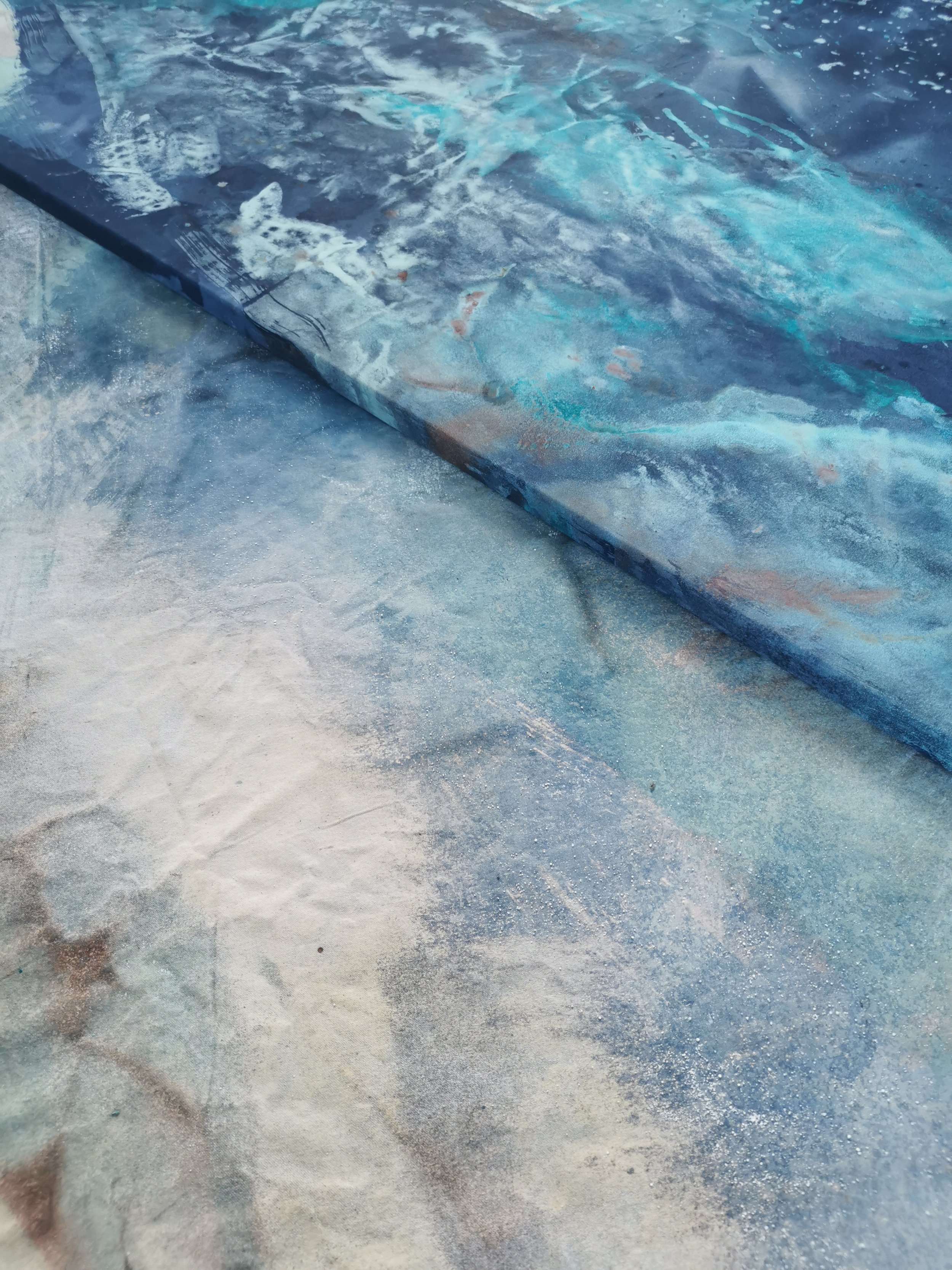
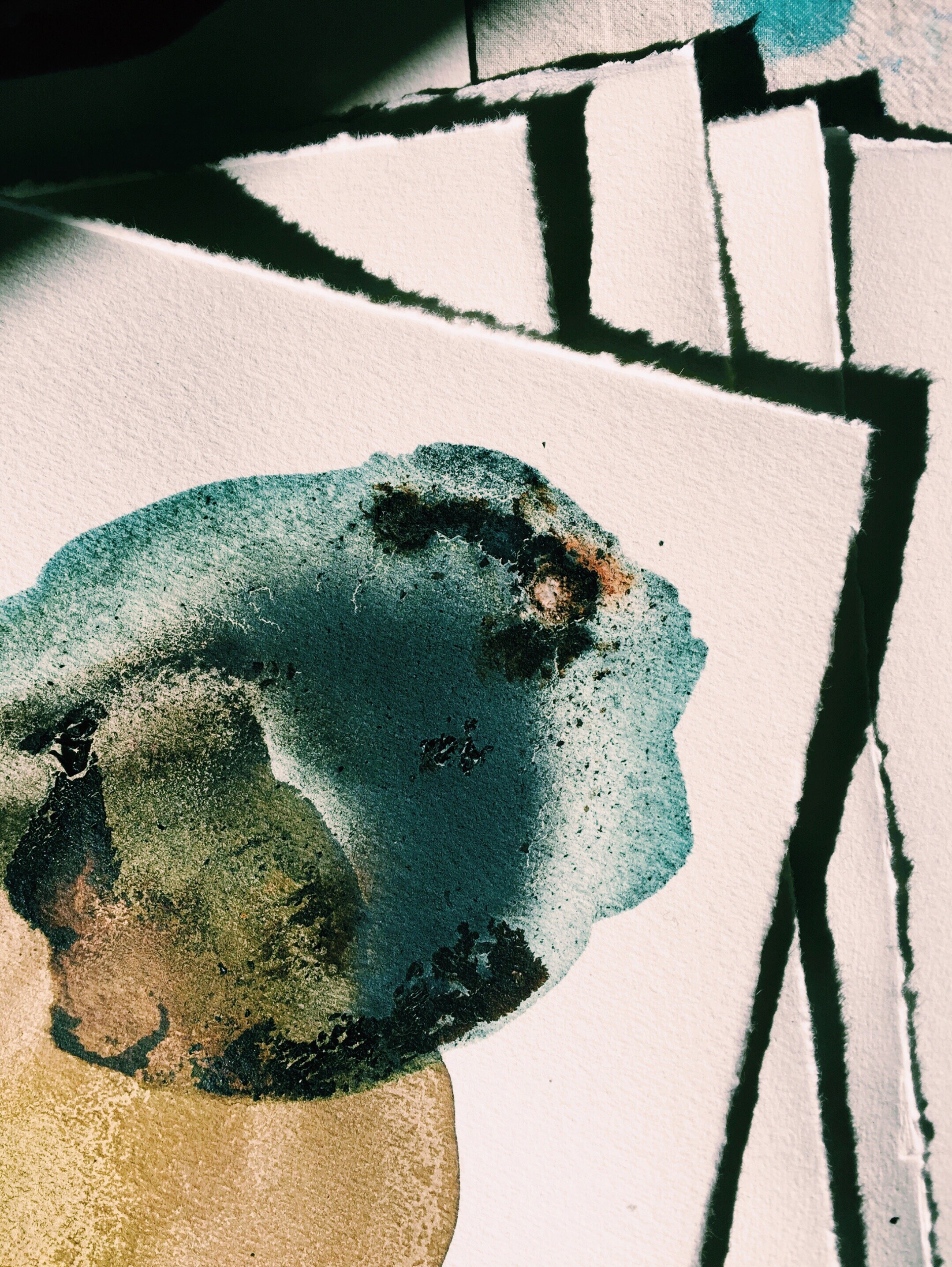
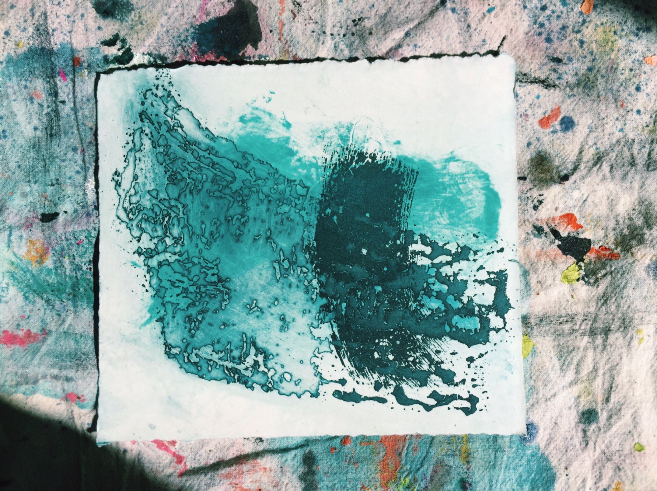
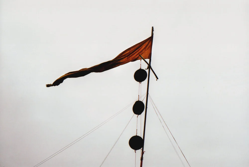
Each day we explored on foot, took photos and made paintings. Down to the temple on the river for a look. The sun’s rays burned through the clouds and onto our papers. We watched them turn from yellow, to teal, to Prussian blue. We bowed in thanks. A twisting plume of incense smoke took the breeze and made a path that led downstream. We flagged a boat and traced the maps that stretched along the water. We crept along canals past stilted dwellings that sagged and leaned against tilted boards, held upright for now.
Back on land we talked of all we’d seen. Bangkok had been very good to us. Its shapes, lines and colour became a framework for our exploration of light. We collected all we had so far and took it on a northbound flight to the walled city beneath the mountains in the province of Chiang Mai.

CNX - CHIANG MAI
Upon arrival the air was wet and cool but the days soon turned to sweltering noons, torrential evening downpours and hot sticky nights. An ease enveloped the journey here. The pace and haste of Bangkok made way for lazy meanders through the inner side streets and half streets of the walled city. We had gathered an essence of the passion and spark to be found by two who travelled so far to explore the potential of connection. We hoped now to bring that spark into the physical for the outside world to see.
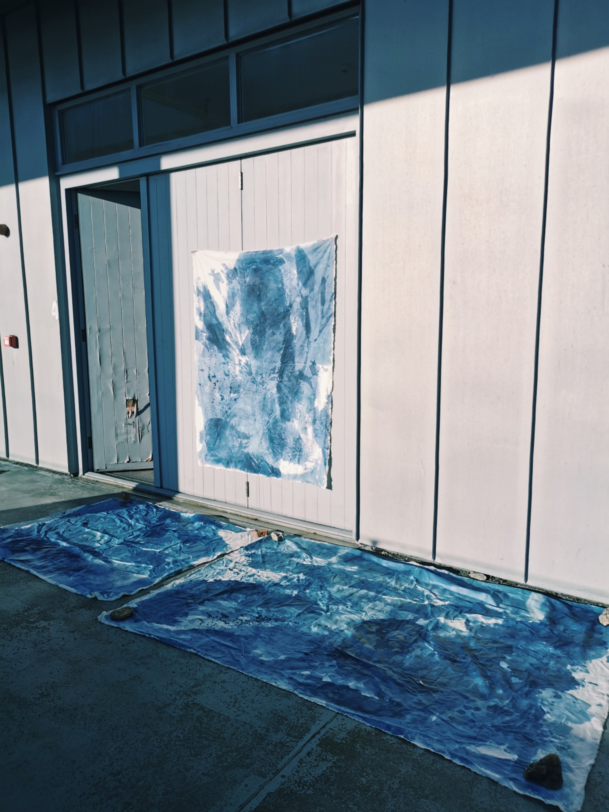
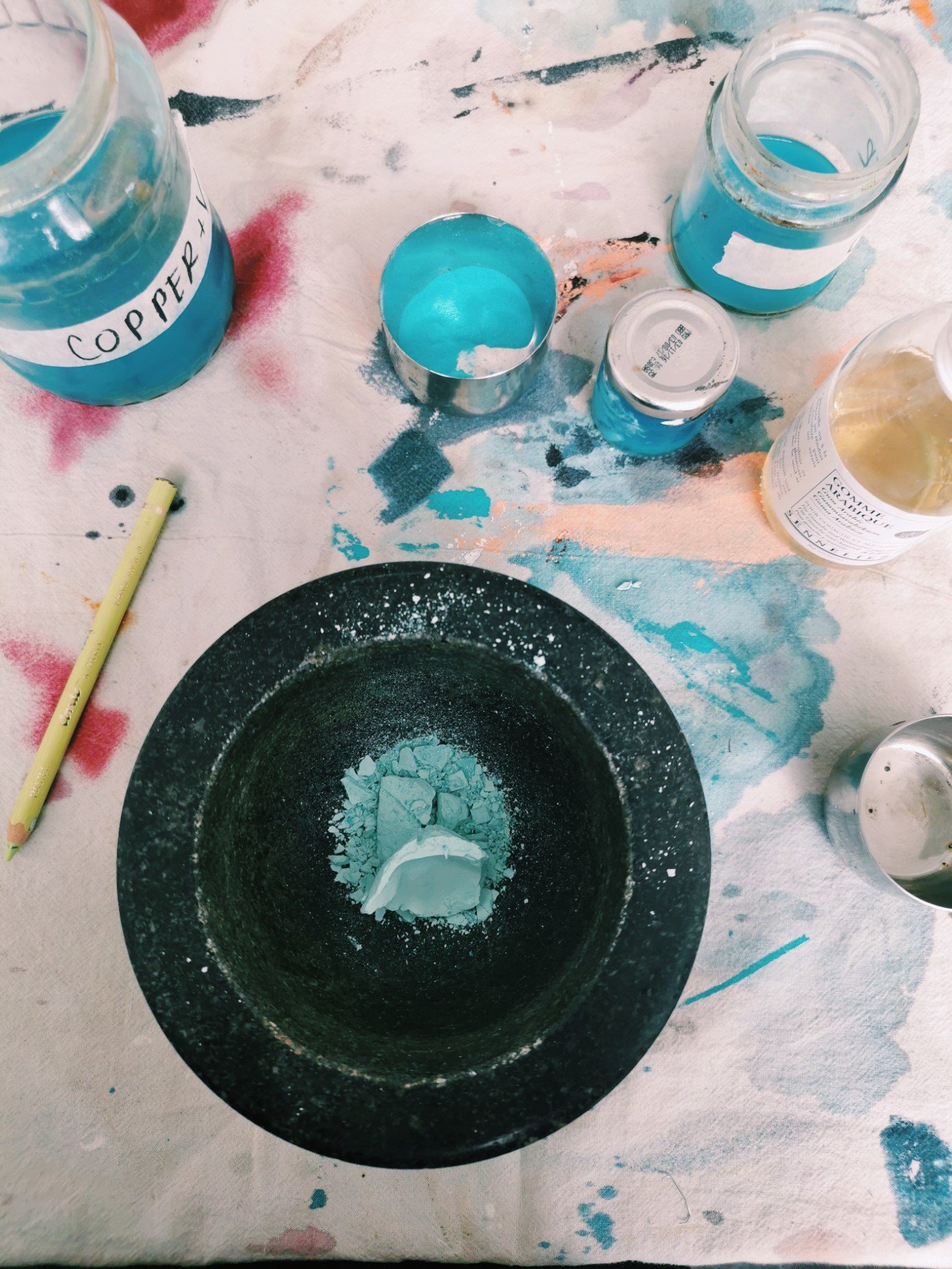
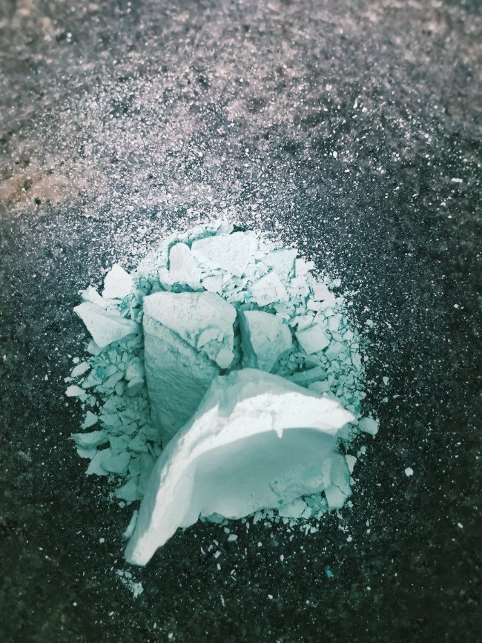
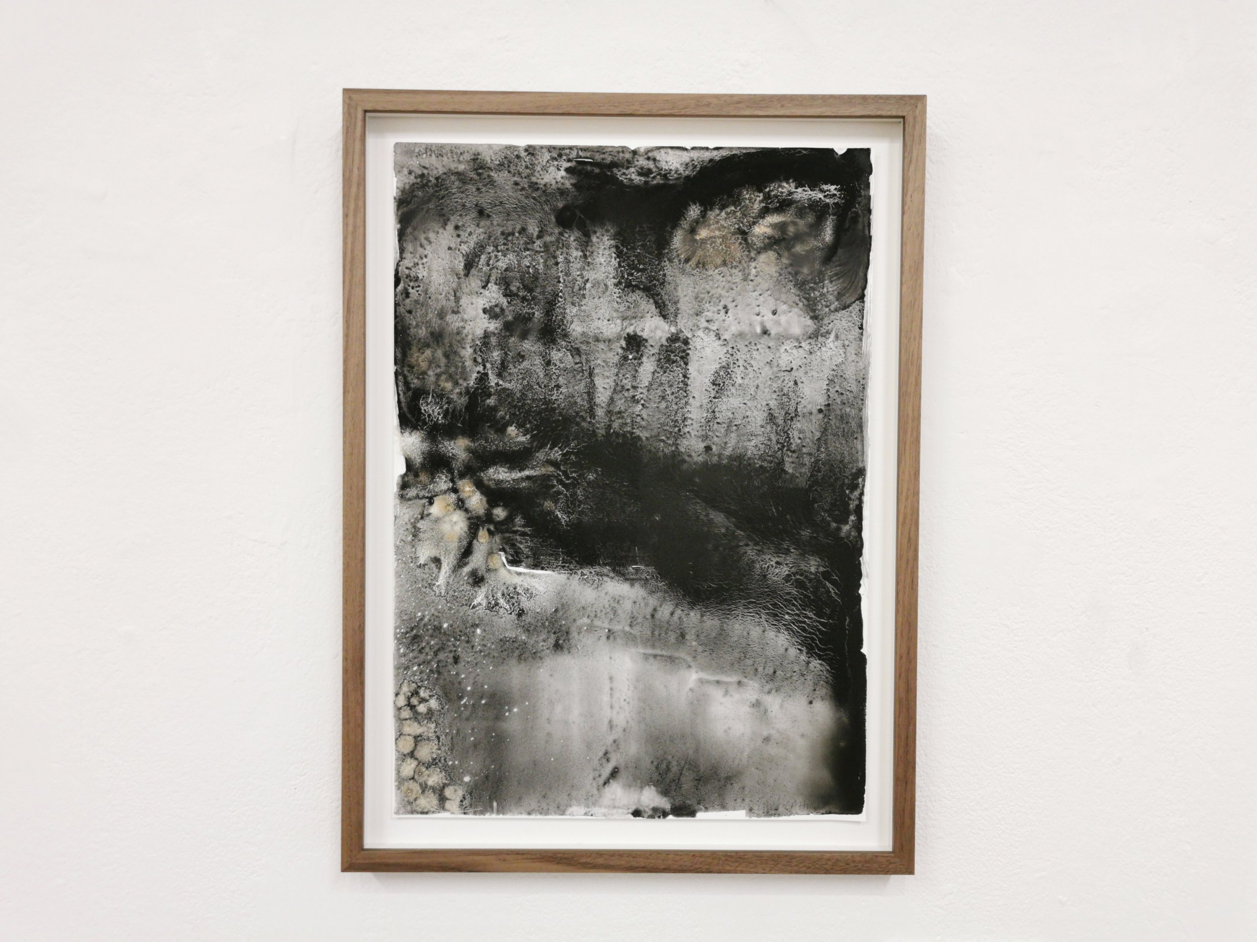
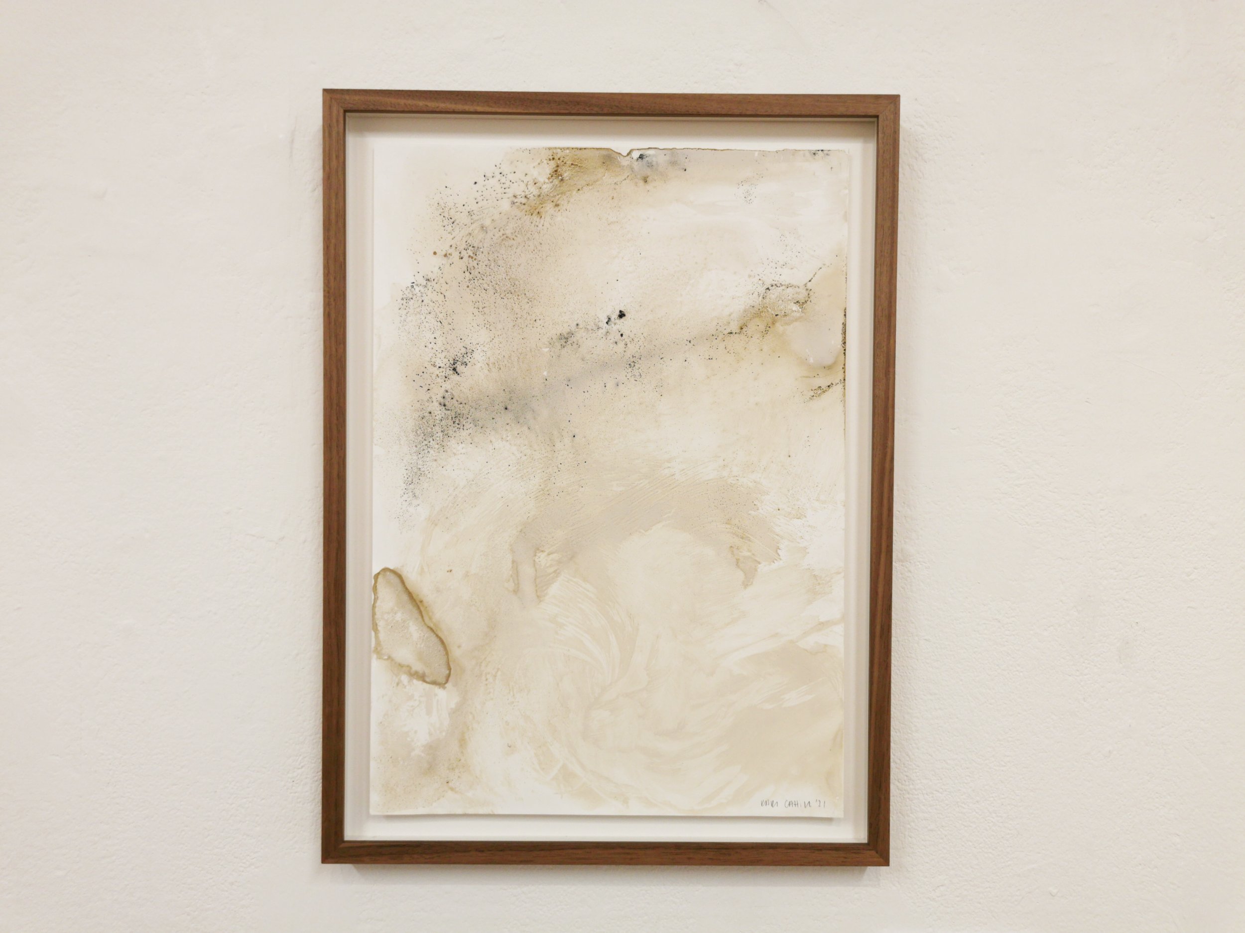
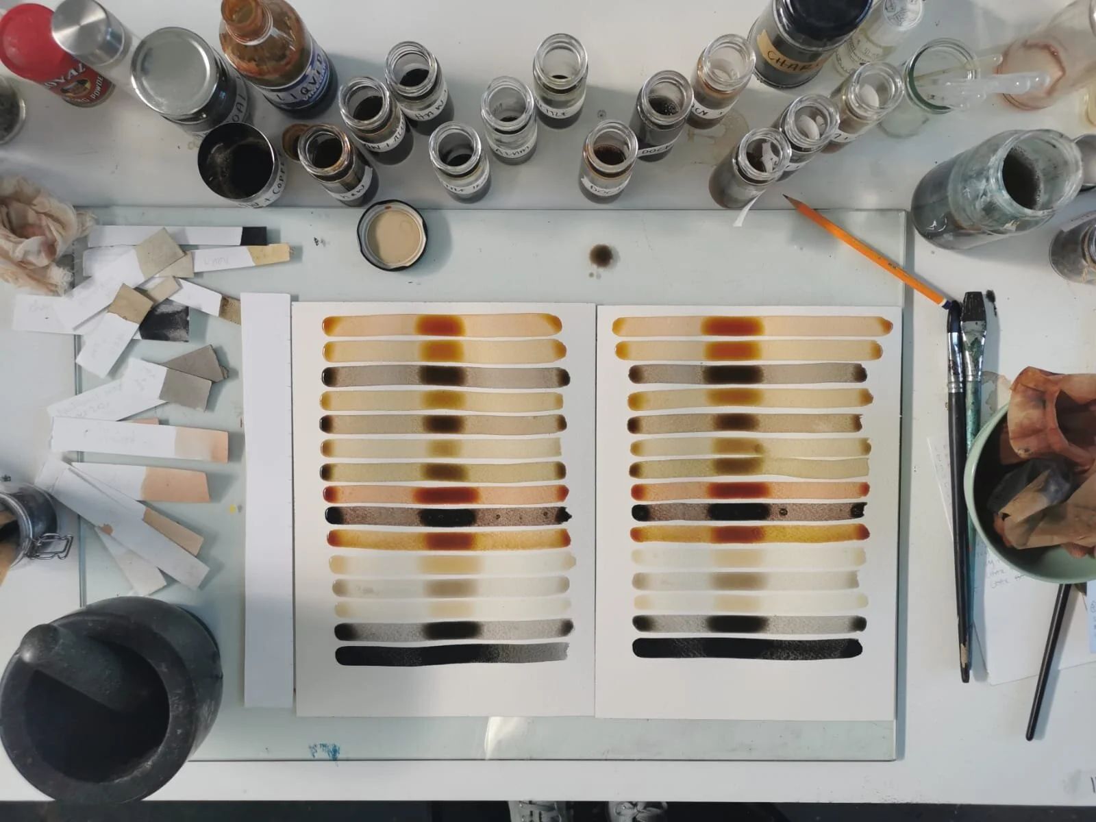
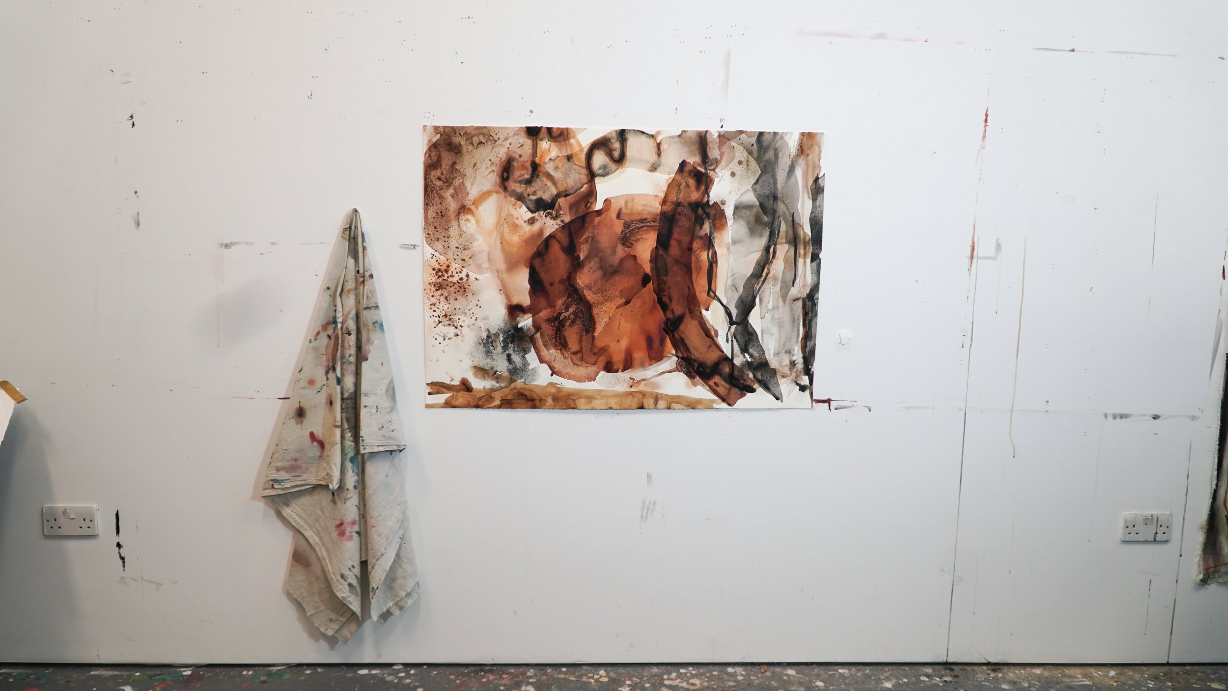
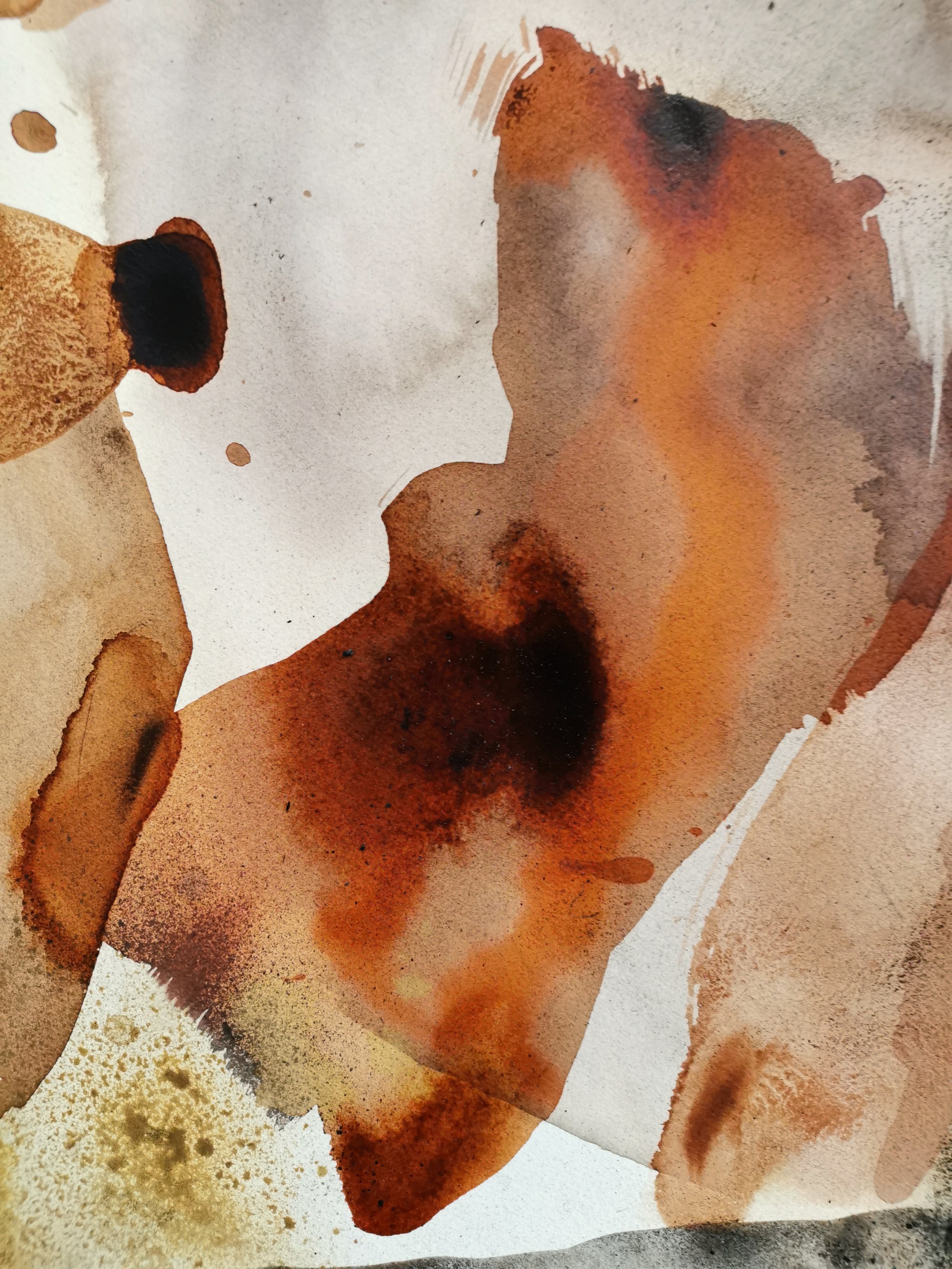
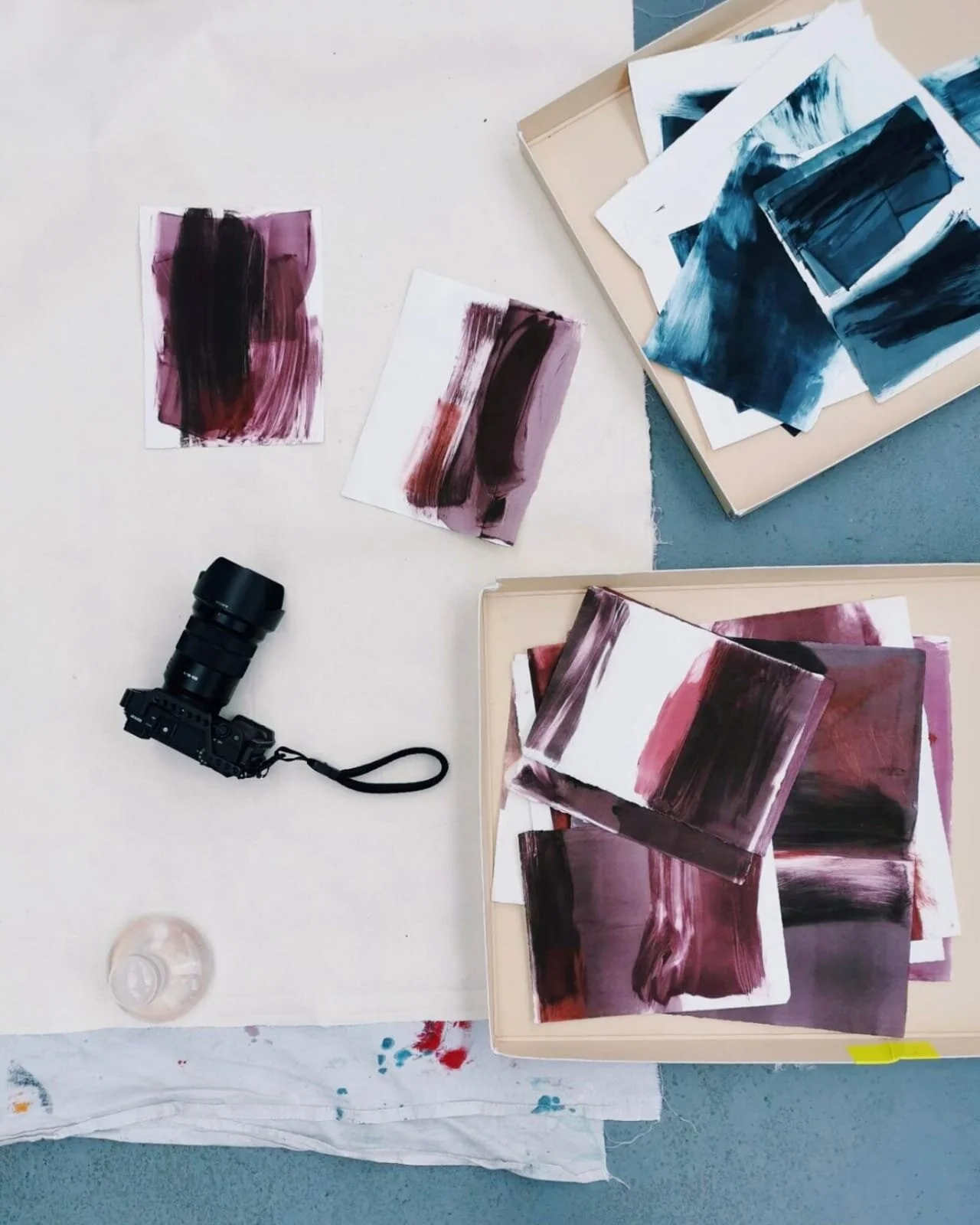
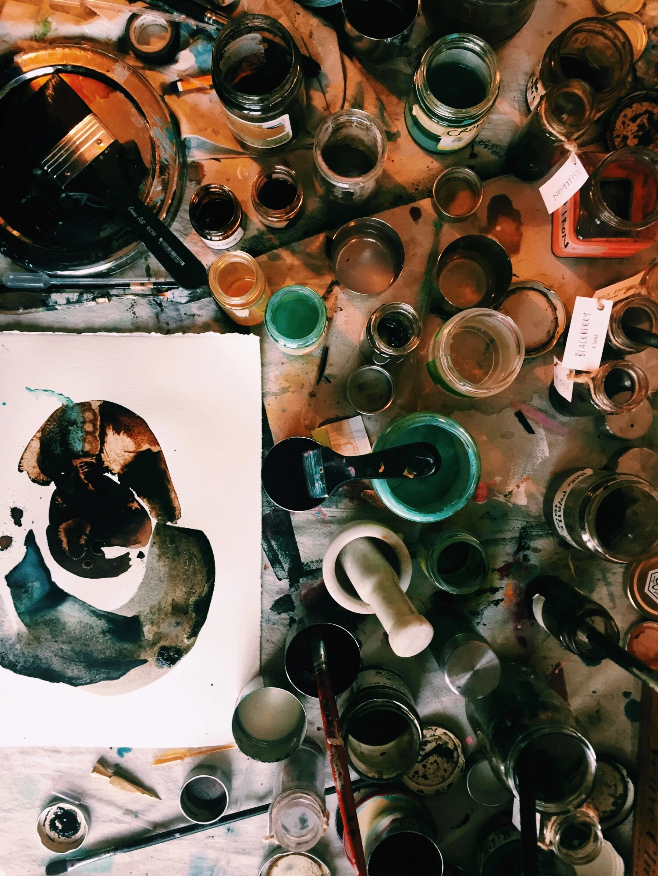
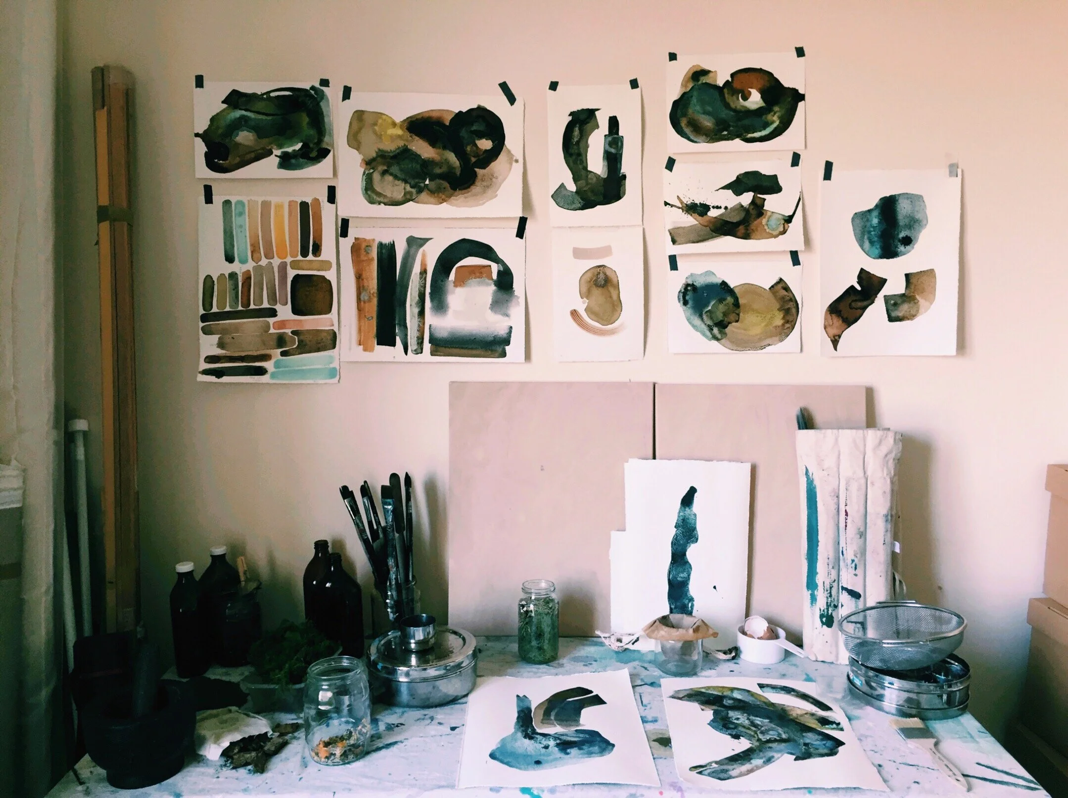
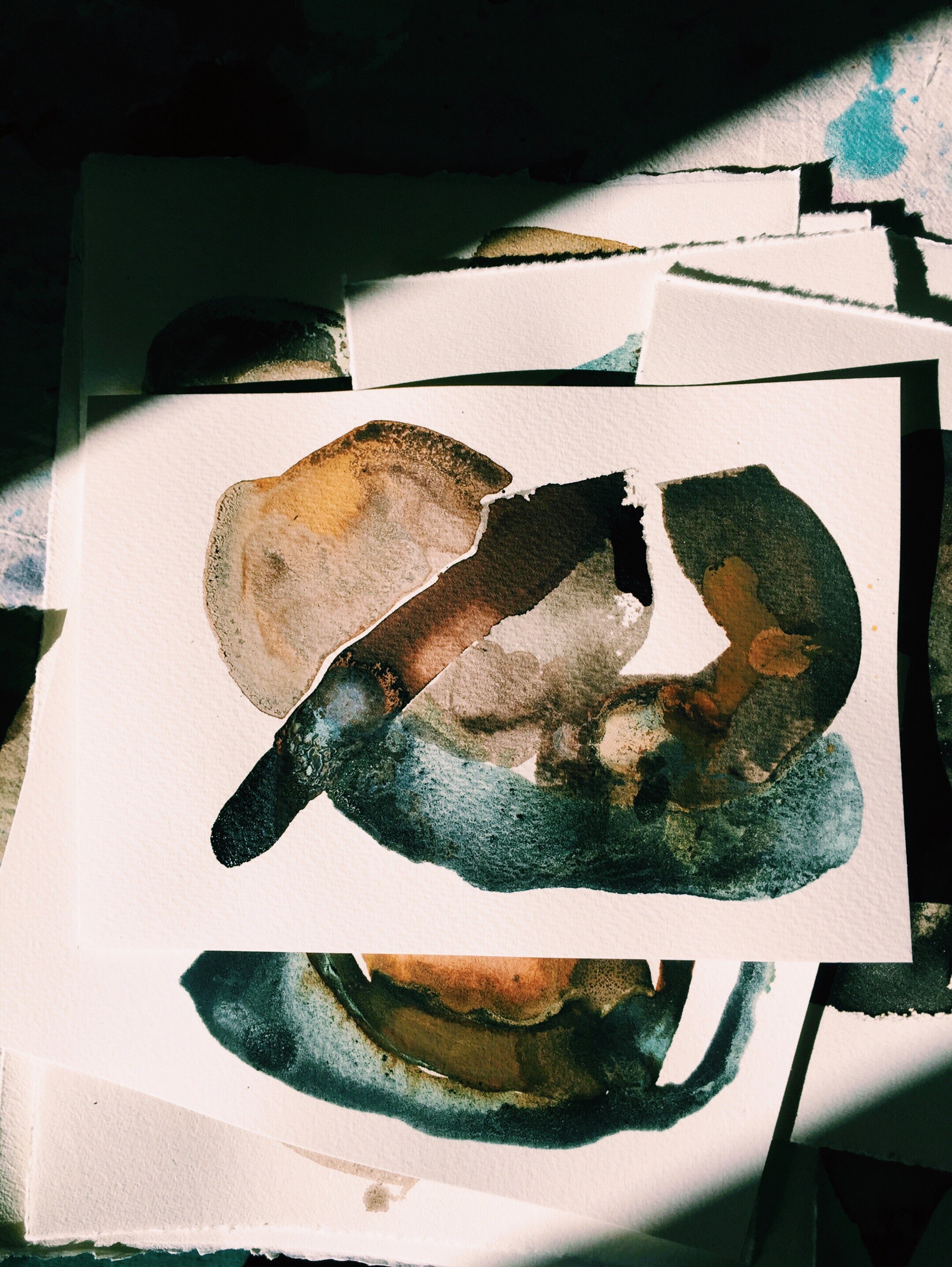
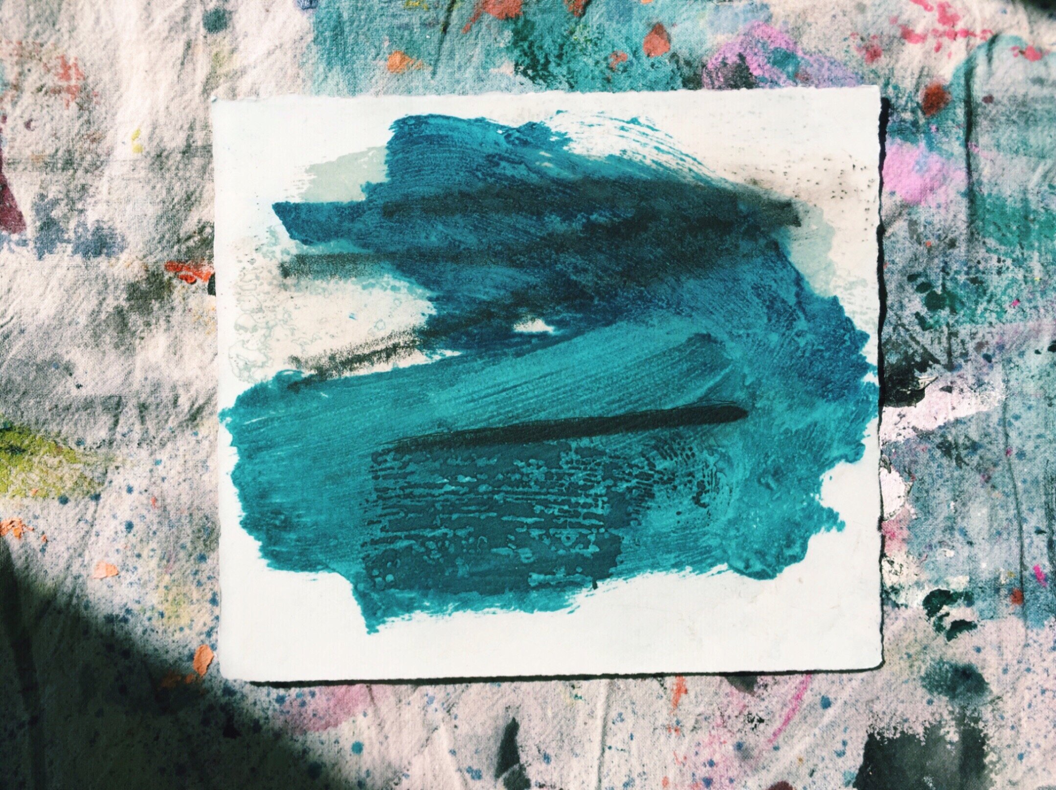
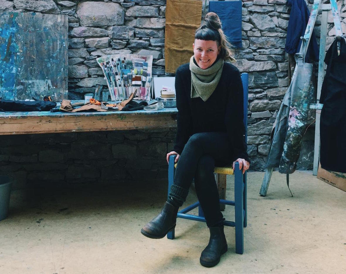
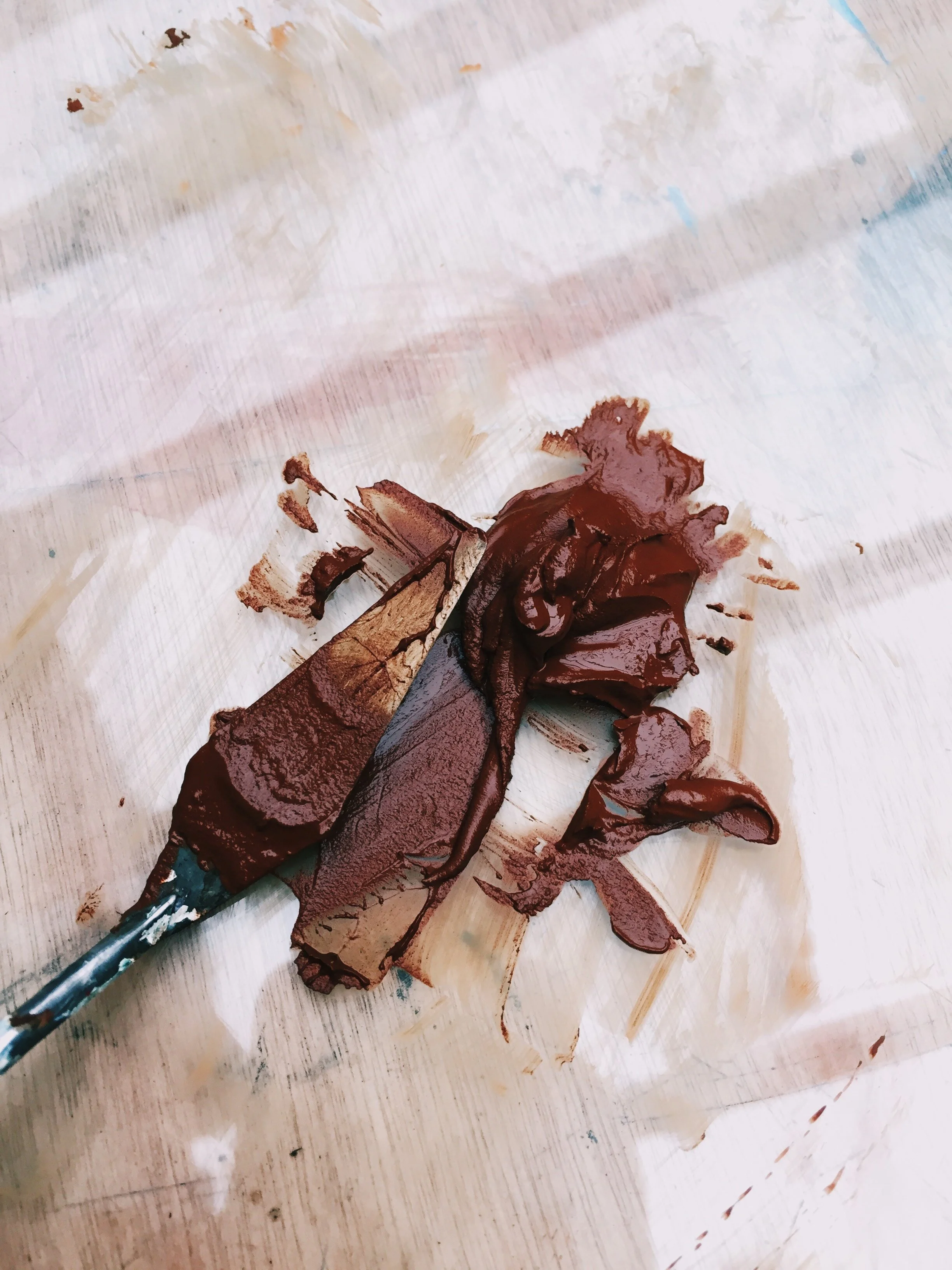
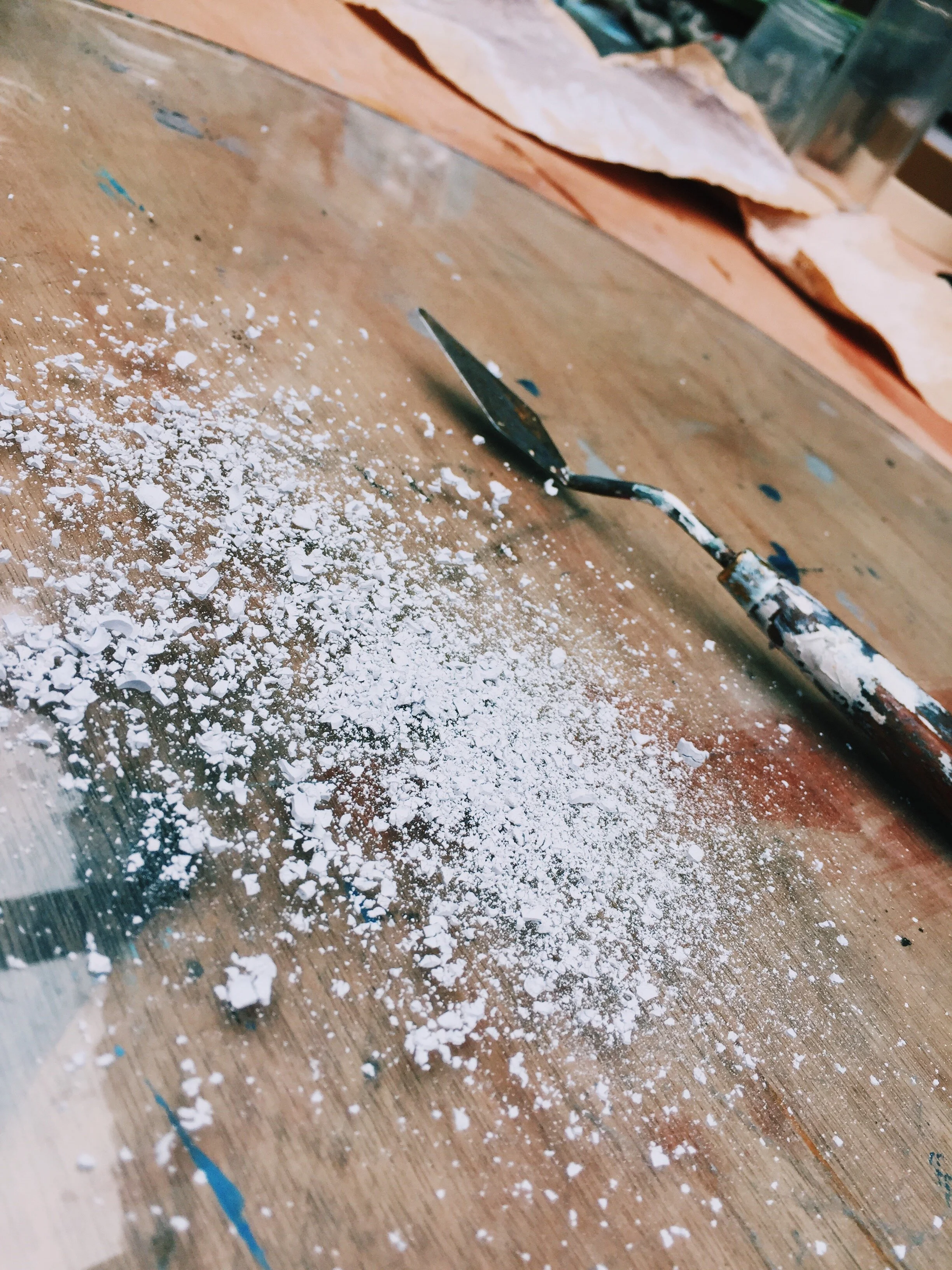
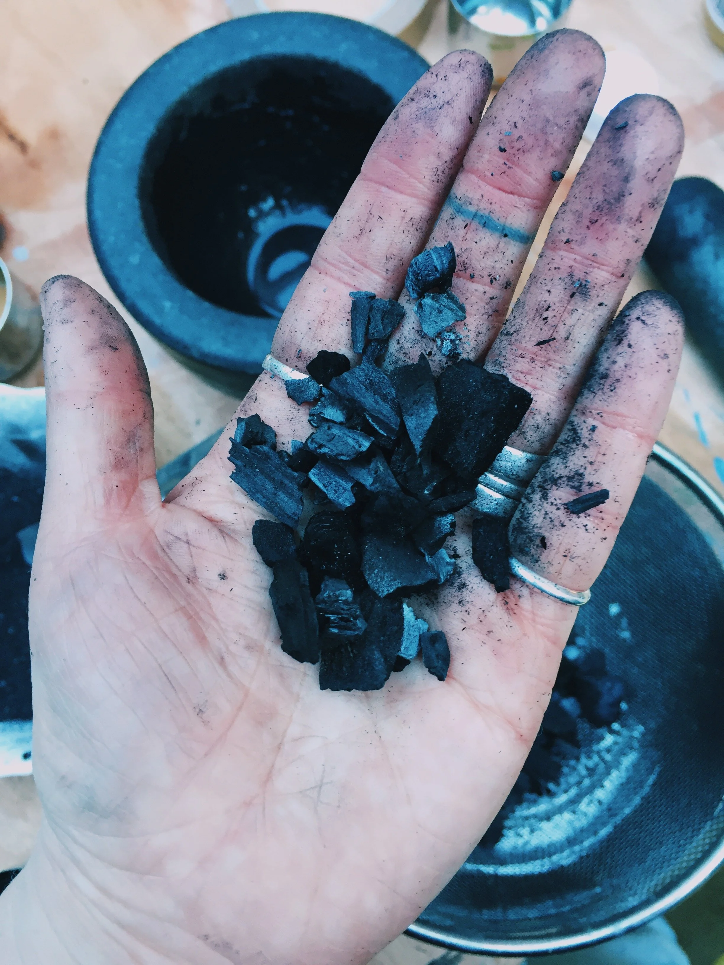
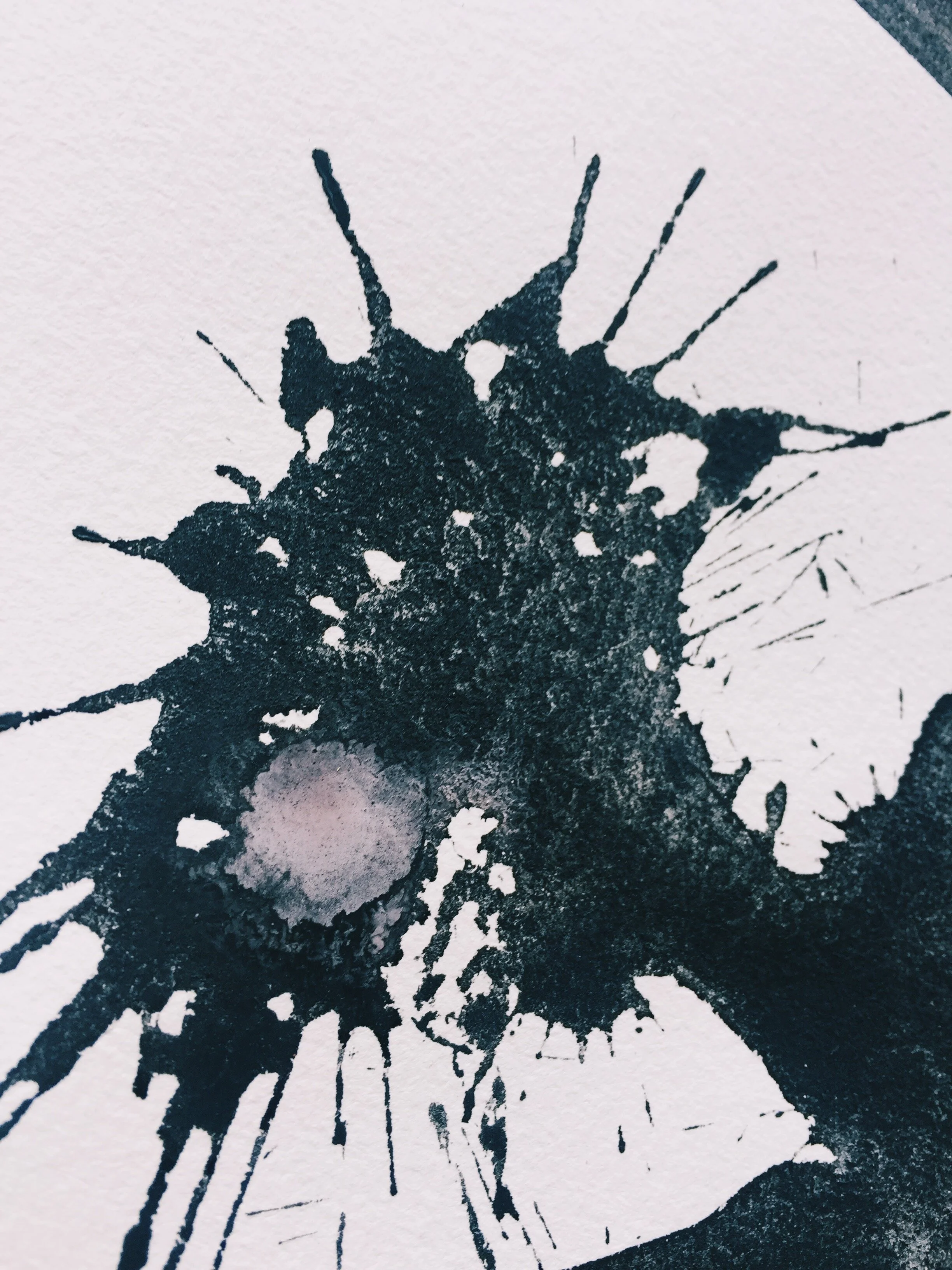
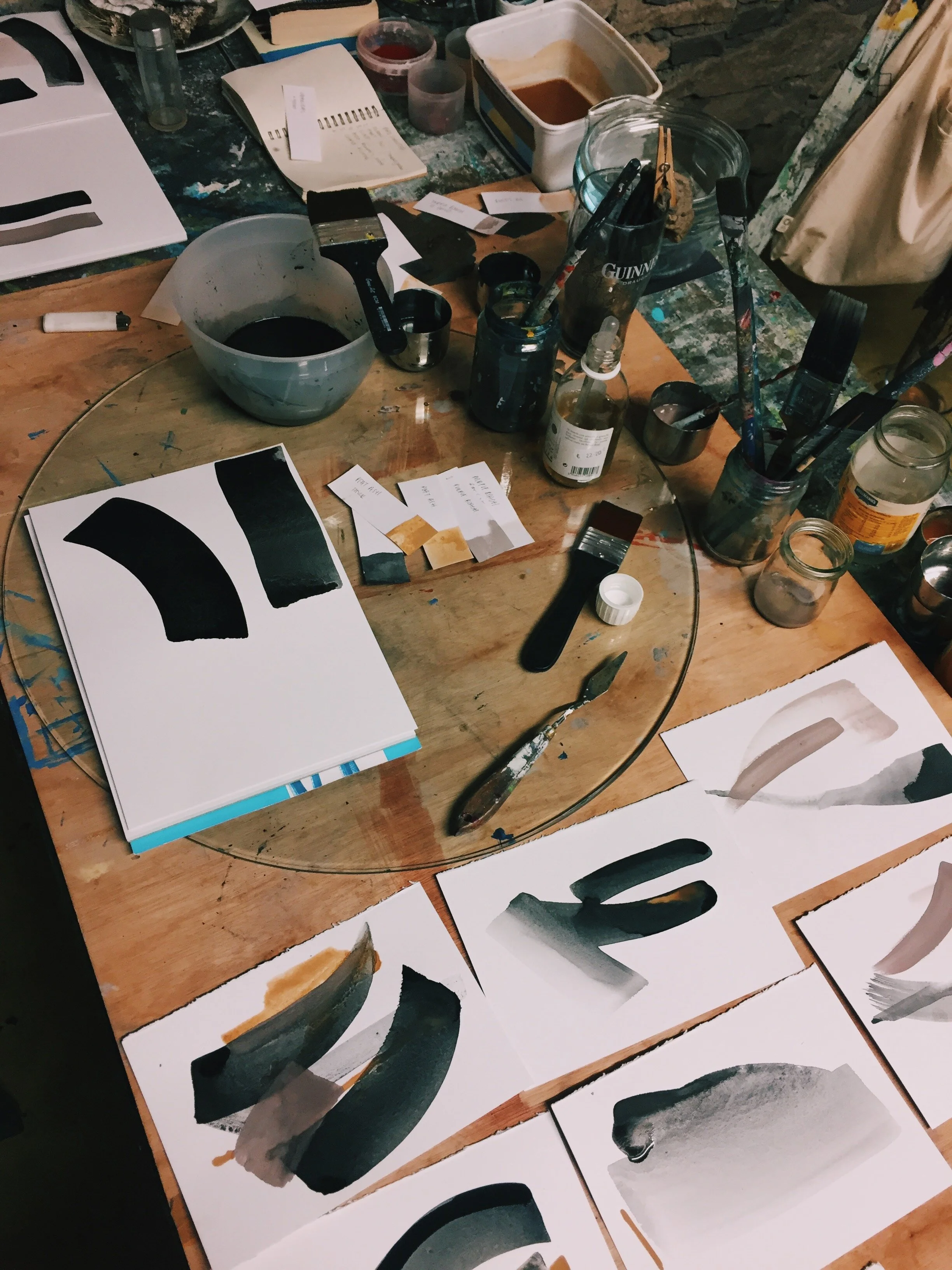
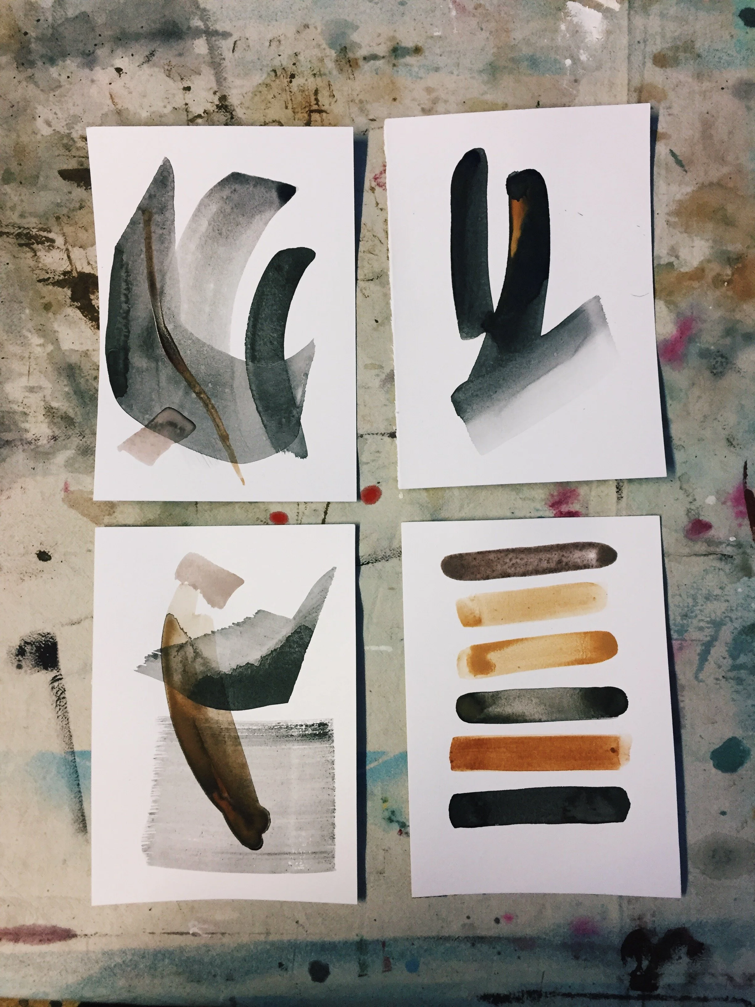
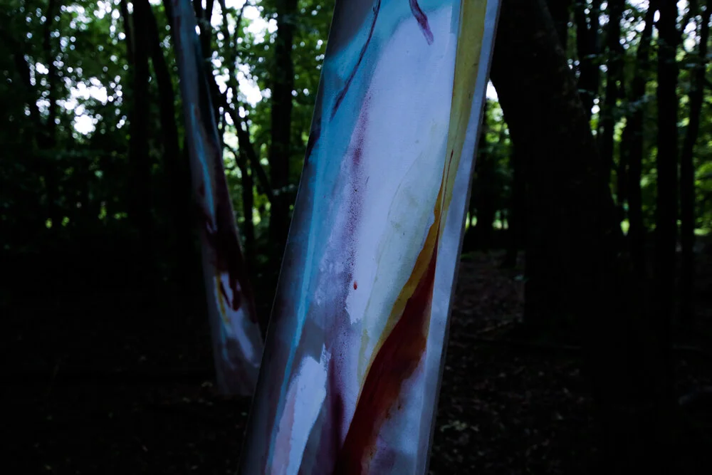
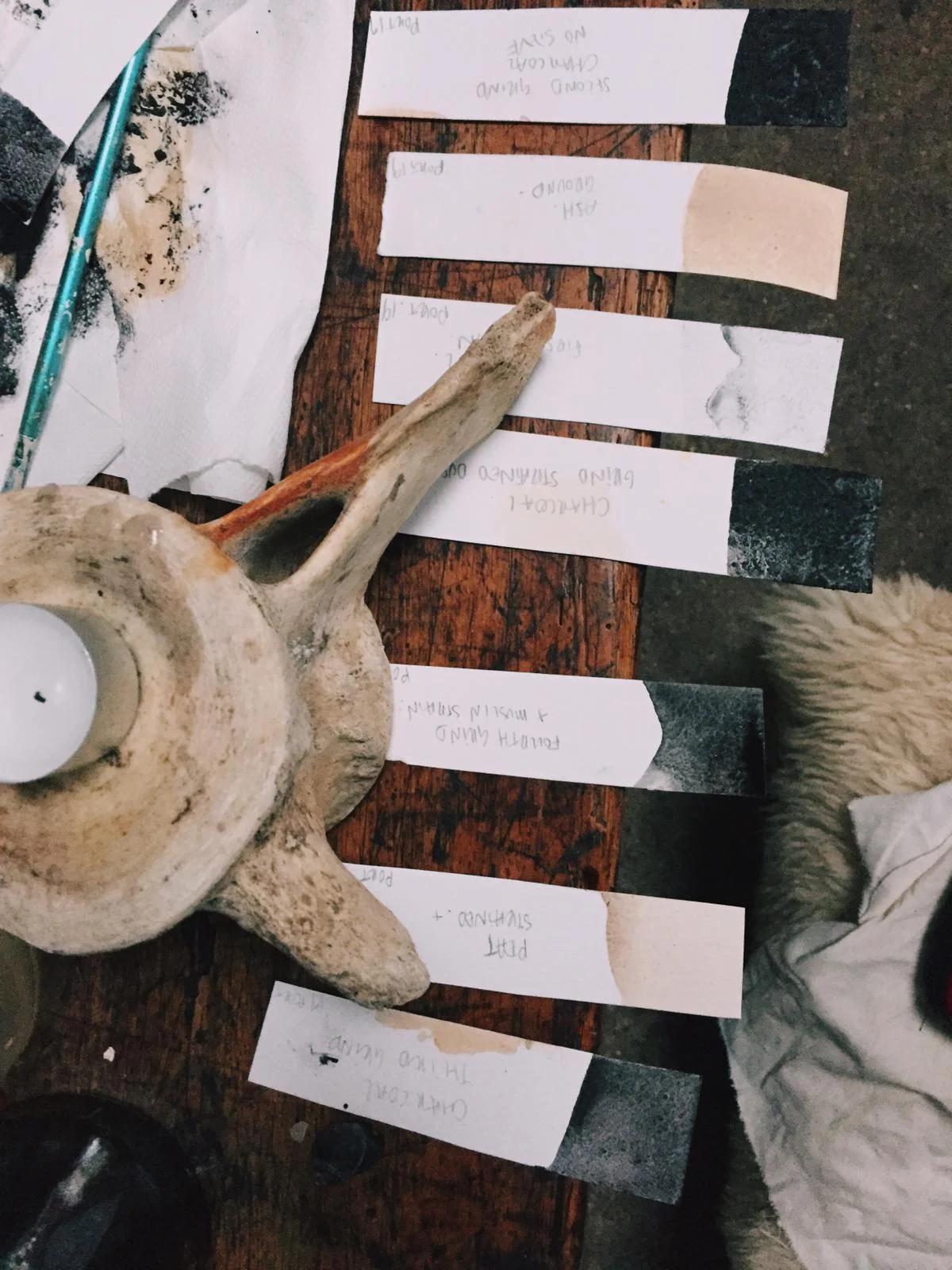
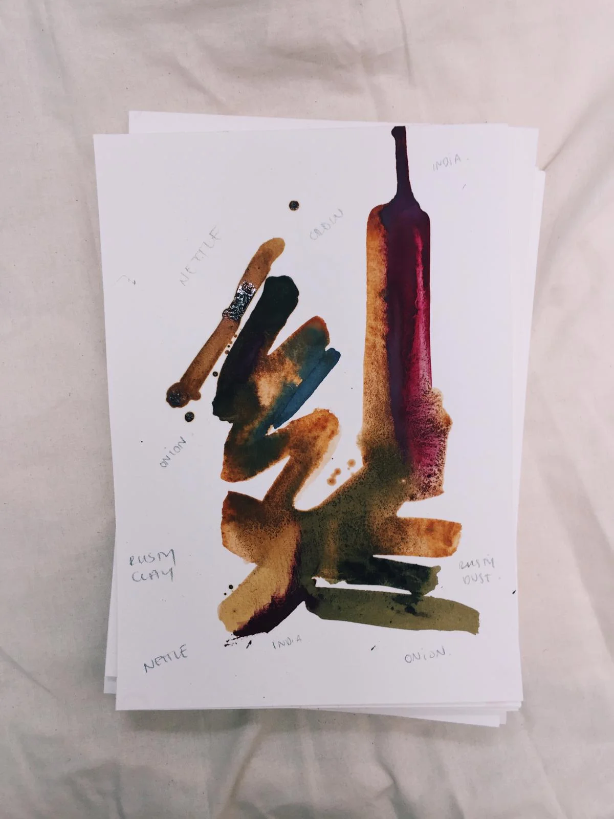
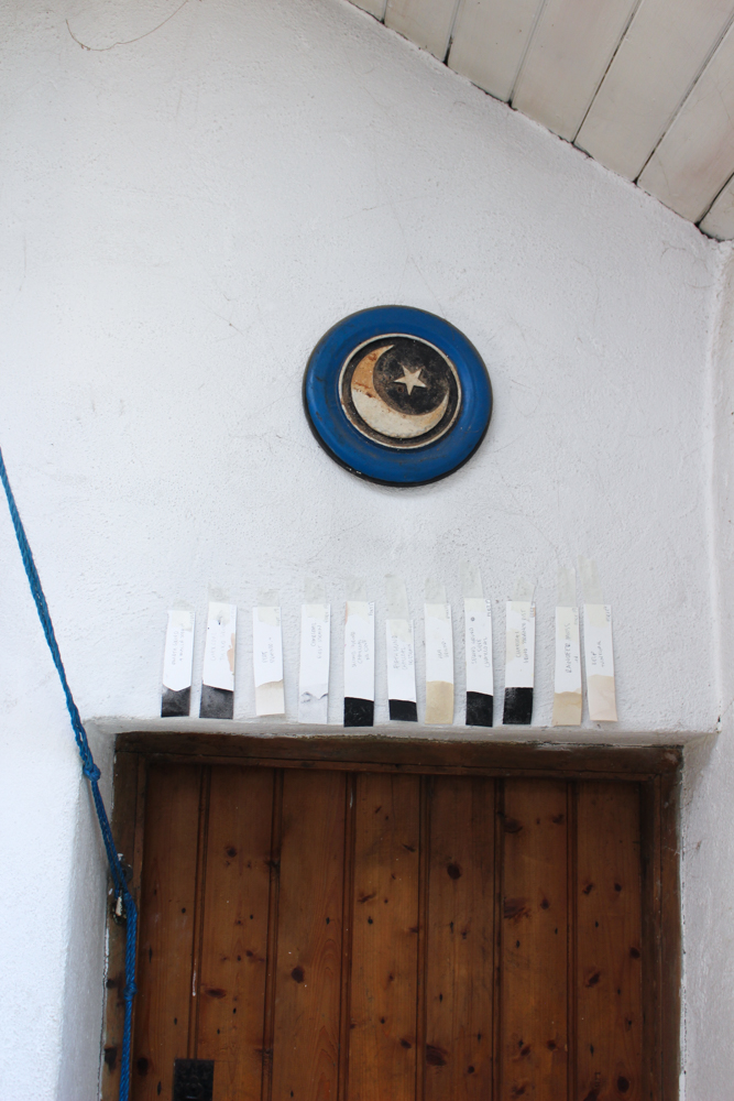
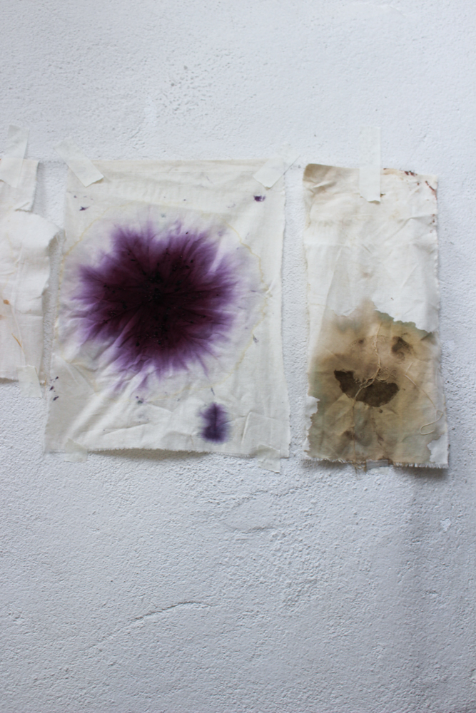
A first floor concrete room was both studio and home. At night we sat cross legged on the porch and drank Sang Som, Shweppes and Singa. With full mouths and minds, we crushed pigment and charcoal, brushed them to page and bled them together. By day the toolbox was assembled. Paper, notebooks, maps and plans piled up on floors and tables. Light sensitive chemicals: potassium ferricyanide and ferric ammonium citrate, panes of glass and photo negatives. Mock-up prints were taped to walls. Endless trials were held as we tuned ourselves to the sun, exposing paintings and photographs when the UV was at its strongest. There on the steps we etched from the sky clear lines and soft curves in deep blue hues.
We took slips of inspiration and the specks of light from the back of the mind, and through the exploration of the space between us formed them into something more defined to the outsider. Now, with stacks and reams of drafts and prints we packed our bags and left the place. Southbound on another plane to an island in the Andaman Sea. Ko Lanta.


KBV - Koh Lanta
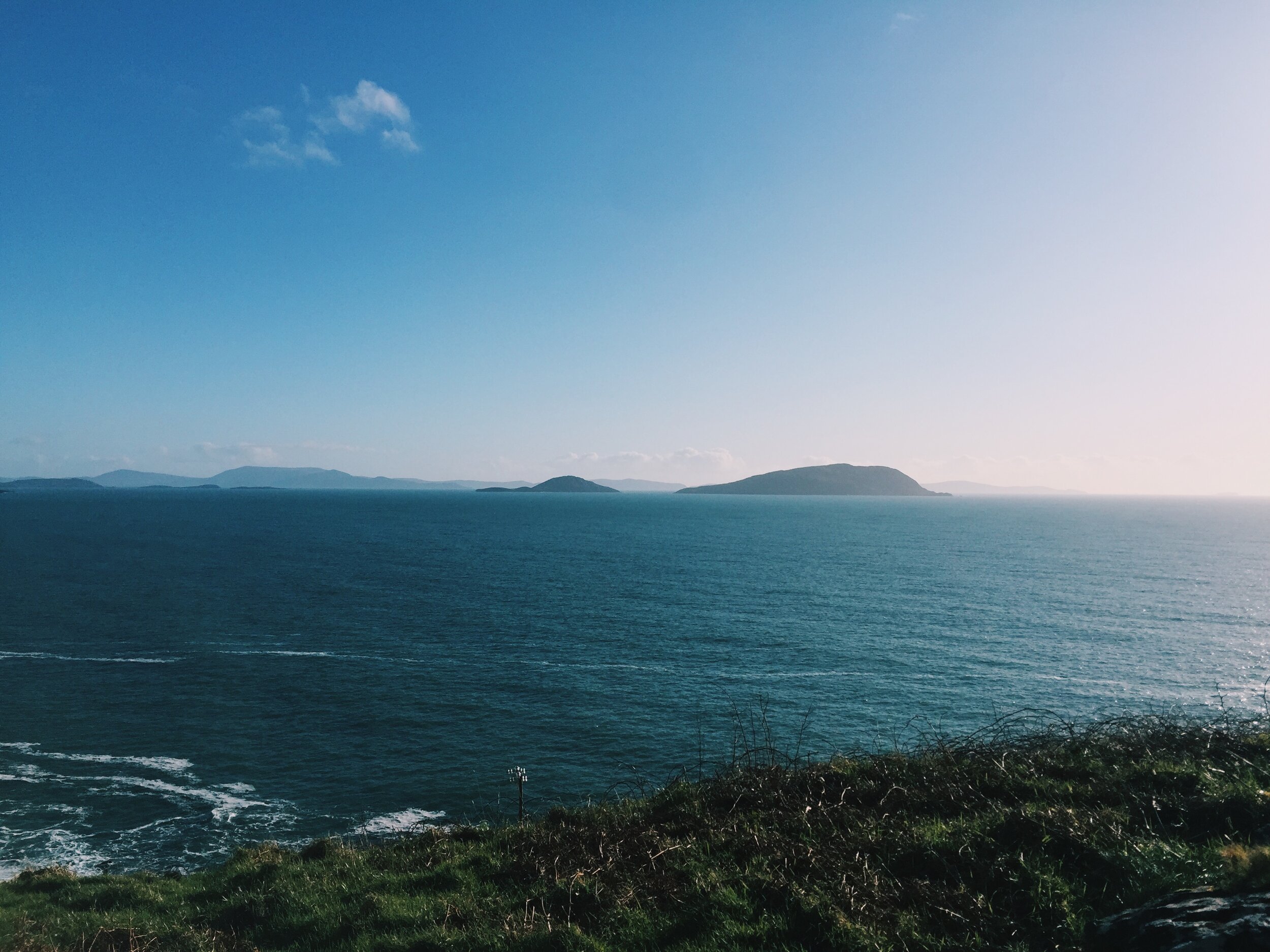
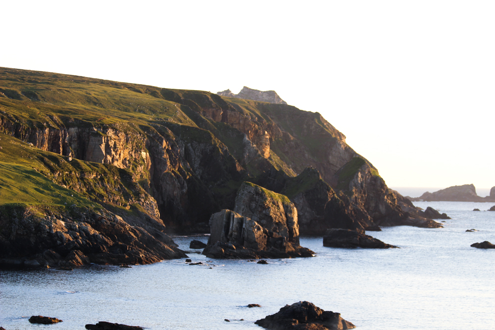
The night we arrived at our villa on the hill we retired to the balcony looking due west over the water and the sky. As we basked in the heat a pulsing insect song curled around us like a rattle. In the distance an evening call to prayer loomed through the dusk and droned amongst the chorus surrounding us as the last rays fell from the sky. On the horizon a line of dark cloud fizzed with lightning and held the sunset to the sea. We dozed and drank and gave our thanks. The earth spun dark another day.
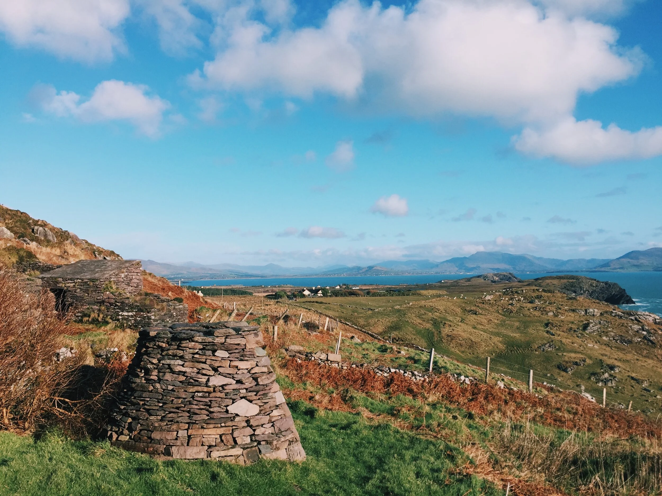
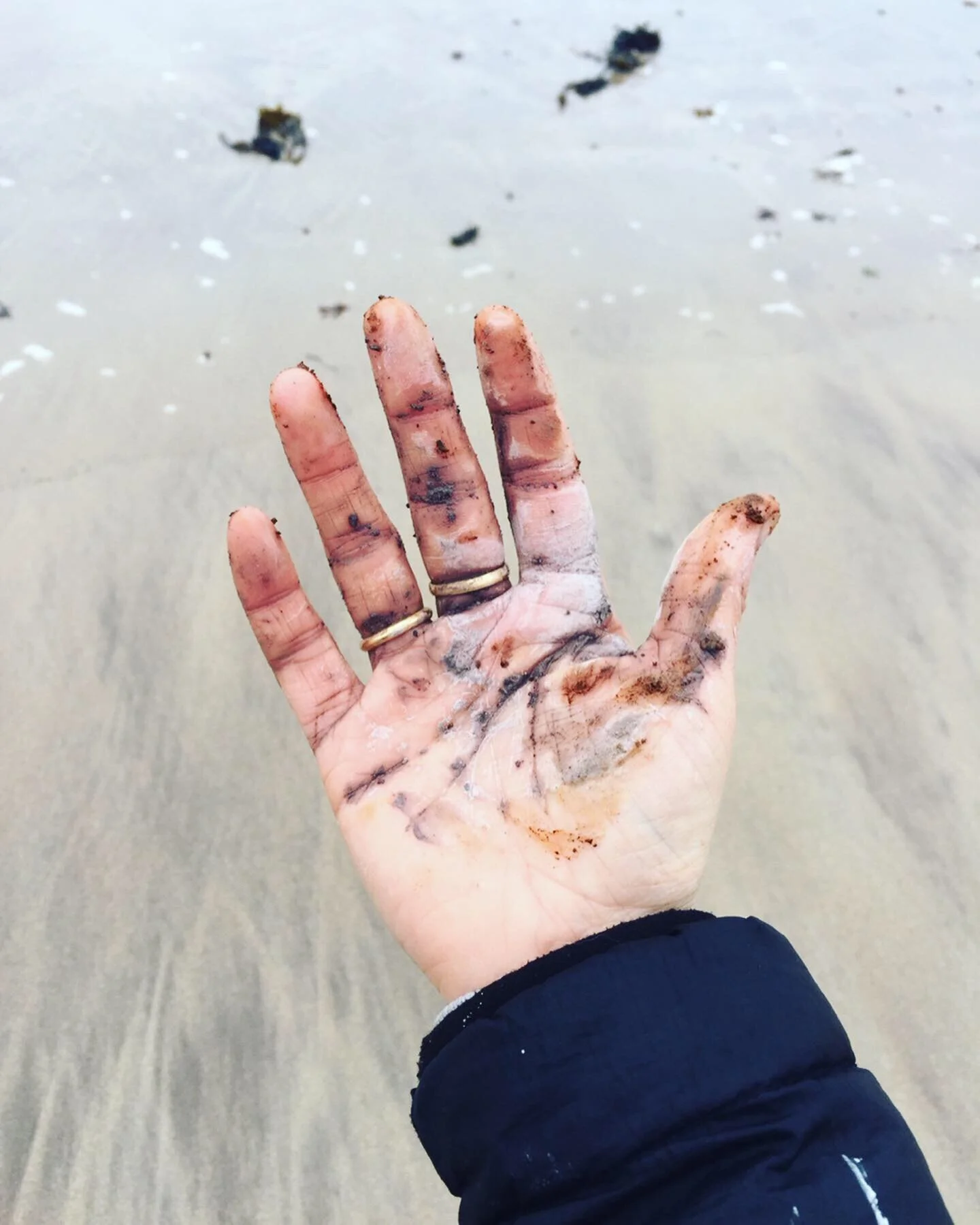
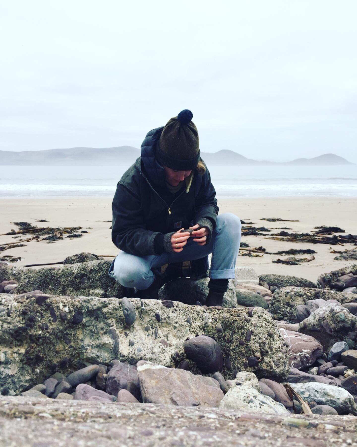
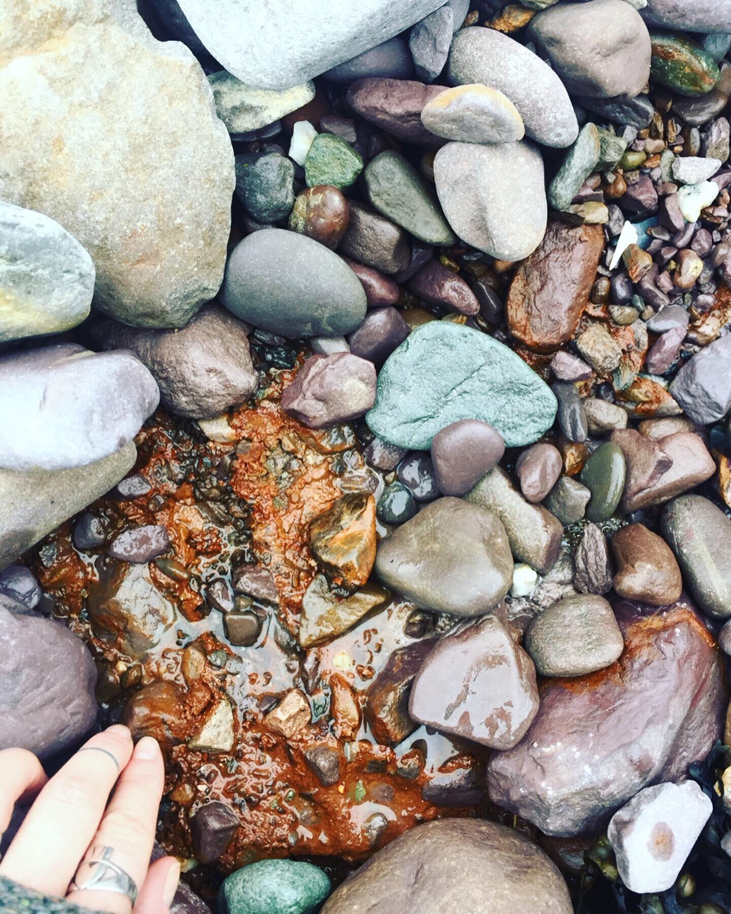
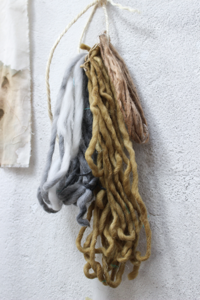
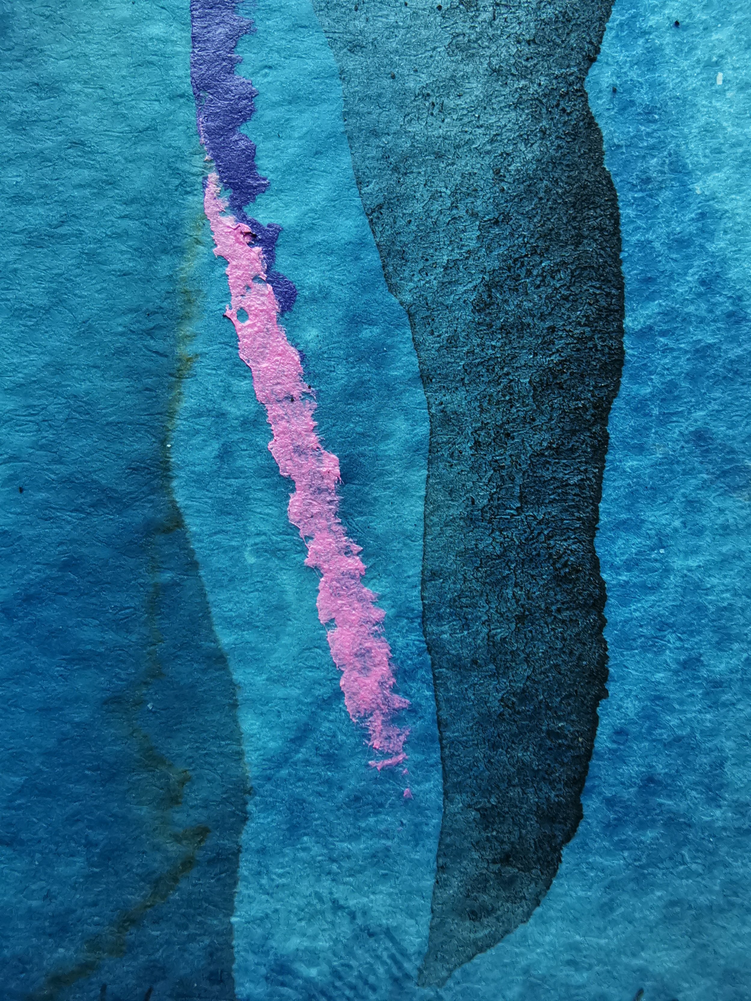
We spent our last week together on the grass in front of our villa exposing cyanotypes in the blistering heat. In the afternoons we explored the island on our Honda Wave. We took the road out to Old Town, stopping on the roadside to collect pink earth pigment, then back to the shoreline just in time to catch the sun before it disappeared. We swam in warm saltwater at sunset in the mandarin glow, laughing out loud at our good fortune.
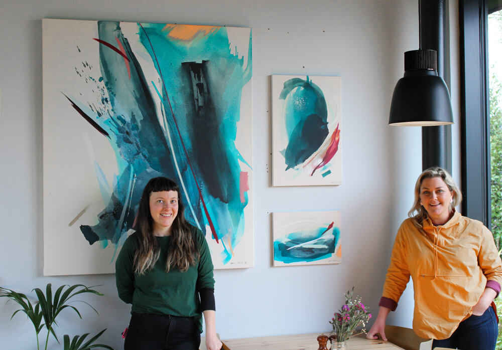
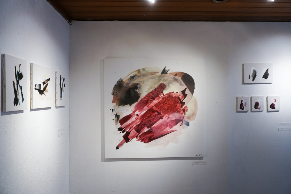
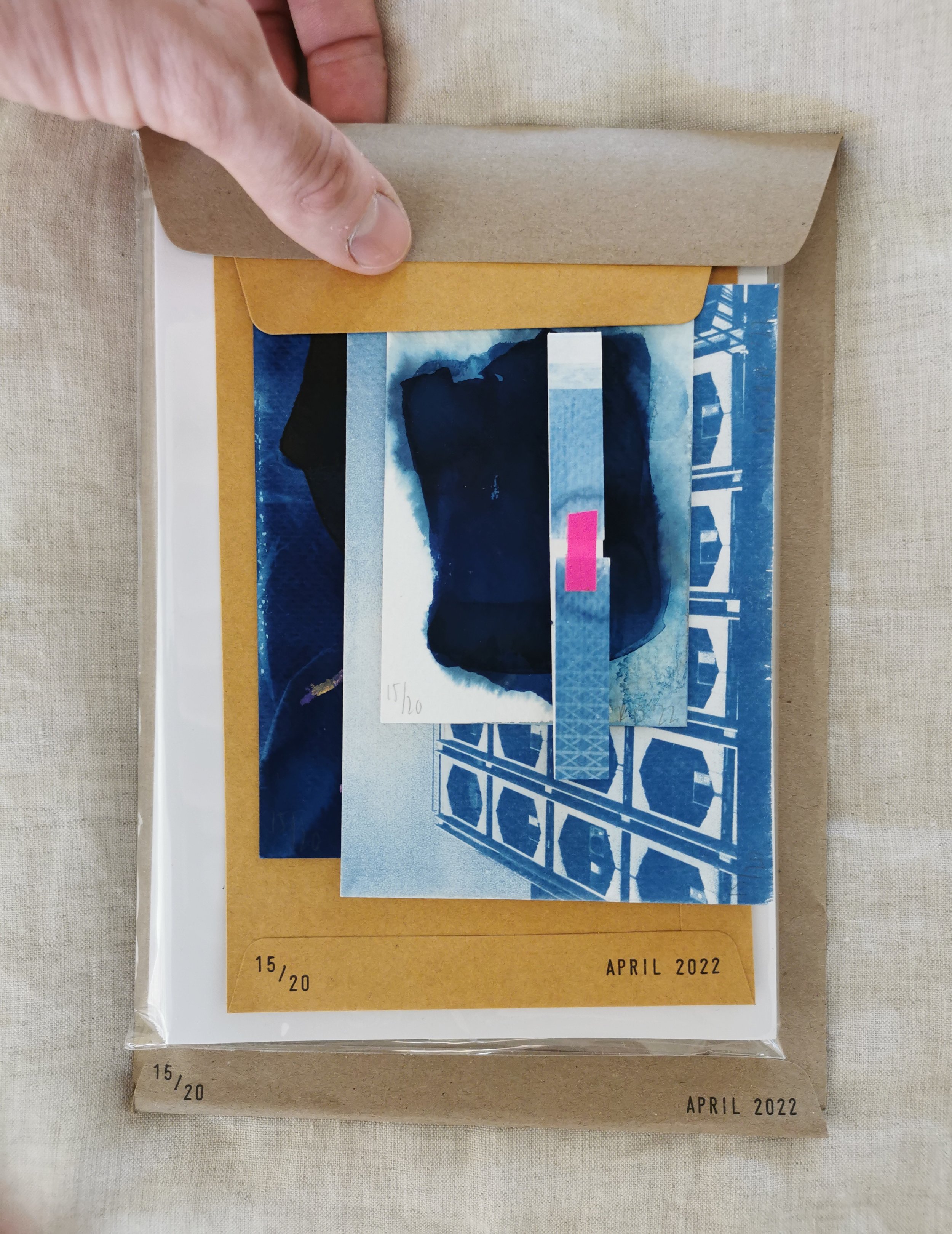
At night we huddled in the cool, tiled room and bound together all we had made. We selected images to sit side by side, pairing photographs and paintings, curating each individual combination for all twenty copies. We neither of us saw it coming, the production line of such a kind, for it was not built but grown, simply, joyfully, through flow in art and love. Our physical portrayal of the light encountered when you go towards what feels right and good.
For us, BKK 222 is a representation of the leap we took in order to be together, to have conversations in person rather than across time zones, to risk our comfort for something unknown. It’s a symbol of what we can achieve creatively and the collaboration to come. It’s a symbol of our light.